2021
Aikei Pharmacy Yanaka
Logos, Visual Identity
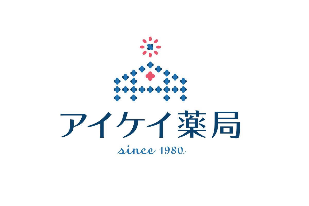
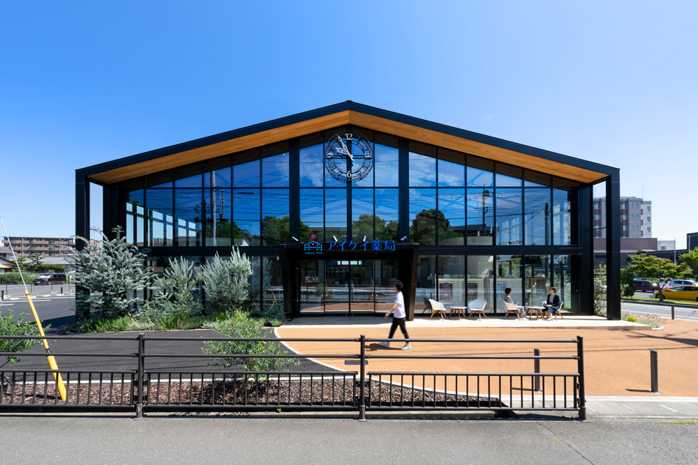
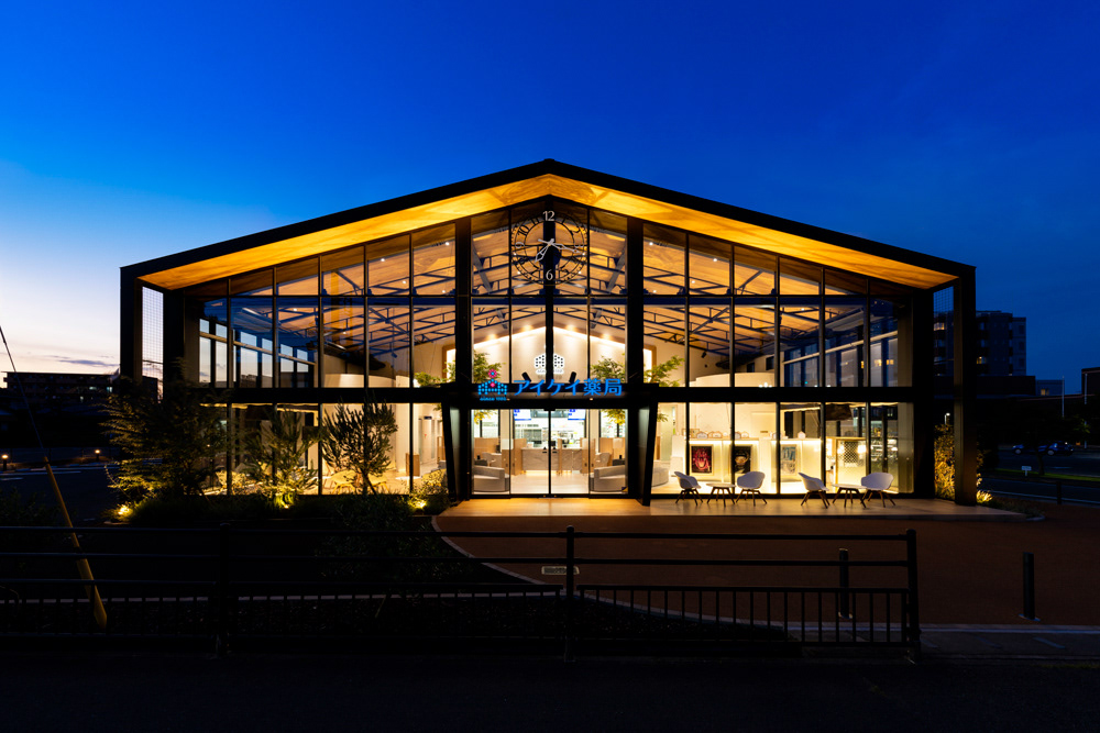
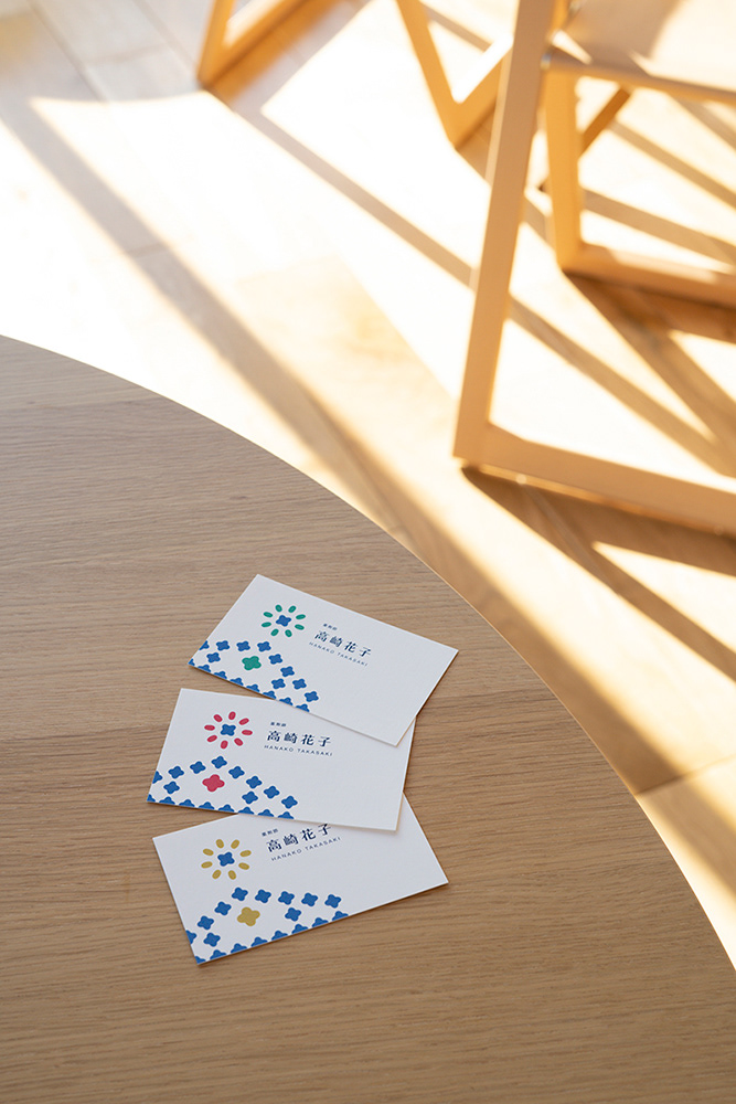
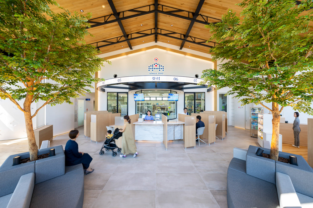
CI renewal of a dispensing pharmacy chain in Takasaki, Gunma Prefecture. “Hygge” is Danish for “coziness”. The design theme of the newly built store was inspired by hygge. The motif uses cross-stitching, which is a traditional Danish embroidery. The logo expresses the image of a pharmacy in a simplified manner with multi-layered meanings, such as “connecting”, with the use of threads of embroidery, “gathering”, with crosses, and “kindness and warmth” of embroidery itself. The overall form expresses the initial “A”, for Aikei Pharmacy and the exterior silhouette of the building. In Japan, the first star that twinkles in the evening is considered #1. Therefor, as the #1 dispensing pharmacy in town this star is incorporated into the logo. And such, the logo represents their wish to rejuvenate the health of the local people through a sense of hygge.
Client: Sun IM Planning Co., Ltd.
Architectural and Interior Basic Plan, Schematic Design, Layout / Logo and Business Card Design / Design Total Supervision / Furniture, Sign and Tower Clock Production, Construction: Tanseisha Co., Ltd.
graphic designer: Shunpei Yokoyama
Photographer: Misono Taichi
Architectural and Interior Basic Plan, Schematic Design, Layout / Logo and Business Card Design / Design Total Supervision / Furniture, Sign and Tower Clock Production, Construction: Tanseisha Co., Ltd.
graphic designer: Shunpei Yokoyama
Photographer: Misono Taichi
—
高崎に展開する薬局のCIリニューアル。新築する店舗の設計テーマ、デンマーク語で「居心地のよさ」を意味する「Hygge(ヒュッゲ)」より、デンマークの伝統刺繍であるクロスステッチをモチーフとした。マークには、刺繍の糸が「つながる」、クロスが「集まる」、刺繍のもつ「優しさ」など、重層的な意味を込め、薬局のイメージをわかりやすく表現した。全体フォルムは「アイケイ薬局」の頭文字「A」と、建物の外観シルエットも表現。地域の一番星として高崎の人々の体と心を元気に、というアイケイ薬局のメッセージを発信している。
施設 : アイケイ薬局 矢中店
事業主 : 株式会社サンアイエム企画
建築および内装基本計画・デザイン・基本設計、ロゴ・名刺デザイン、 全体デザイン監修、 家具・店舗サイン・塔時計施工 : 株式会社丹⻘社
グラフィックデザイナー : 横山俊平
撮影 : 御園生 大地
事業主 : 株式会社サンアイエム企画
建築および内装基本計画・デザイン・基本設計、ロゴ・名刺デザイン、 全体デザイン監修、 家具・店舗サイン・塔時計施工 : 株式会社丹⻘社
グラフィックデザイナー : 横山俊平
撮影 : 御園生 大地