2019
Becker’s Burger
Logos, Visual Identity, Signage
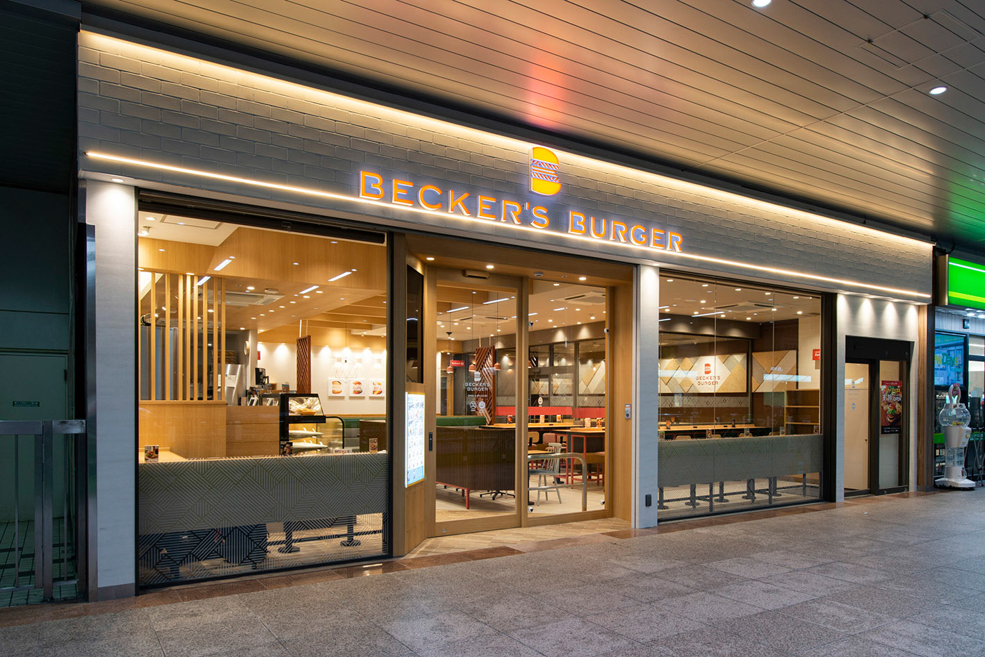
Design for the renewal of a hamburger chain that operates stores mainly at train stations in central Tokyo. A project that was to transform the basic and old-fashioned image of the past into a more representative and modern image. The logo and in-store graphics have entirely been redesigned.
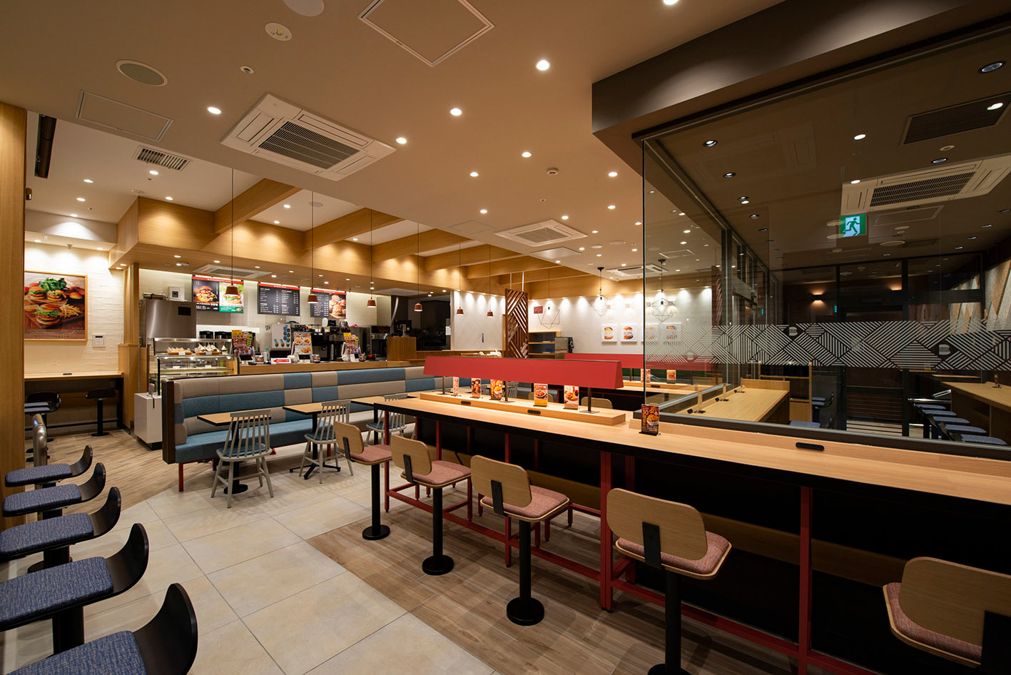
I pursued the common ground between the authentic taste, which I experienced firsthand, and a new concept of “smart and simple” with the graphic design. The letter B initial is used as the main symbol, and at the same time, the deliciousness of a real hamburger is expressed in the silhouette of the B. The striped part represents the meat patties and ingredients, and in conjunction, the louvers in the stores. It was developed to be used in various places, items, and pictograms as a graphic pattern throughout the store. A moist red clay that is vivid, yet earthy, expresses the deliciousness, therefor it was selected as the main color. By using this principal color on signage and doors, a rhythm occurs in the interior space with that of natural materials, such as light white wood and glass.
Client: JR East Cross Station Co., Ltd.
Planner / Director: EAST JAPAN MARKETING & COMMUNICATIONS, INC.
Interior Design: Soil
Designer: Shunpei Yokoyama
Planner / Director: EAST JAPAN MARKETING & COMMUNICATIONS, INC.
Interior Design: Soil
Designer: Shunpei Yokoyama
—
都心の駅を中心に展開するハンバーガーチェーンのリニューアル。それまでの重厚でオーセンティックなイメージからライトでニュートラルなブランドへ生まれ変わるプロジェクト。シンボルマークから店内グラフィックまで一新した。
試食して実感した本格的な美味しさと、スマートでシンプルという新しいコンセプトとの着地点をグラフィックデザインで探った。名称頭文字である「B」をシンボルに掲げ、同時に本格ハンバーガーの美味しさもシルエットで表現。ストライプ部分はお肉や具材を表し、店内のルーバーと連動し、グラフィックパターンとして様々なシーン、ツールやピクトグラムへ展開した。
基調色はビビッドでありつつ軽くない、おいしさを表現できる、しっとりとした赤土色。白木やガラスなど天然素材中心の内装において、この基調色がサインや扉などに展開し、空間にリズムを作っている。
試食して実感した本格的な美味しさと、スマートでシンプルという新しいコンセプトとの着地点をグラフィックデザインで探った。名称頭文字である「B」をシンボルに掲げ、同時に本格ハンバーガーの美味しさもシルエットで表現。ストライプ部分はお肉や具材を表し、店内のルーバーと連動し、グラフィックパターンとして様々なシーン、ツールやピクトグラムへ展開した。
基調色はビビッドでありつつ軽くない、おいしさを表現できる、しっとりとした赤土色。白木やガラスなど天然素材中心の内装において、この基調色がサインや扉などに展開し、空間にリズムを作っている。
クライアント: ジェイアール東日本フードビジネス株式会社
企画・ディレクター:ジェイアール東日本企画
内装設計:株式会社soil
デザイナー:横山俊平
企画・ディレクター:ジェイアール東日本企画
内装設計:株式会社soil
デザイナー:横山俊平