Parabolic Flight Management
Logos, Visual Identity
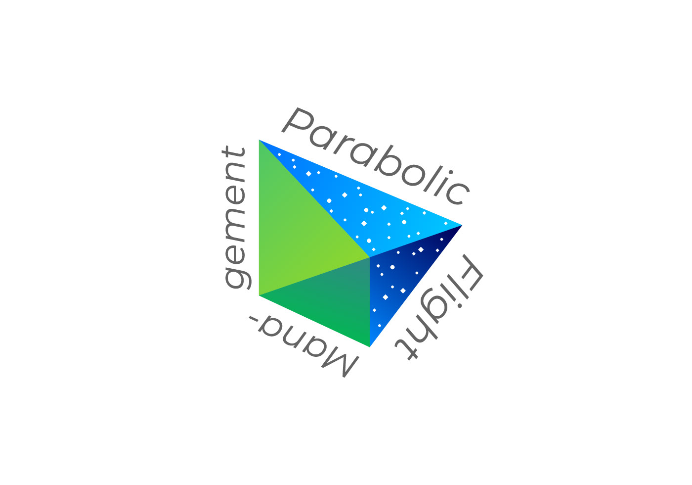
A symbol mark represents to support those who takes on the challenge of space. I chose a "paper airplane" as a motif for a symbol of childhood dreams. It expresses the excitement of looking up at the sky and the idea that space is an extension of that dream. As space becomes closer than before, the symbol mark sends out a message that the experiences and feelings that only astronauts have had until now will be opened and shared to the public. The green part on the left side of the mark represents the earth, and the other part blue for space. These two parts symbolize the company's role of connecting people and space.
Client: Parabolic Flight Management Inc.
Art Direction: Shunpei Yokoyama Design Office