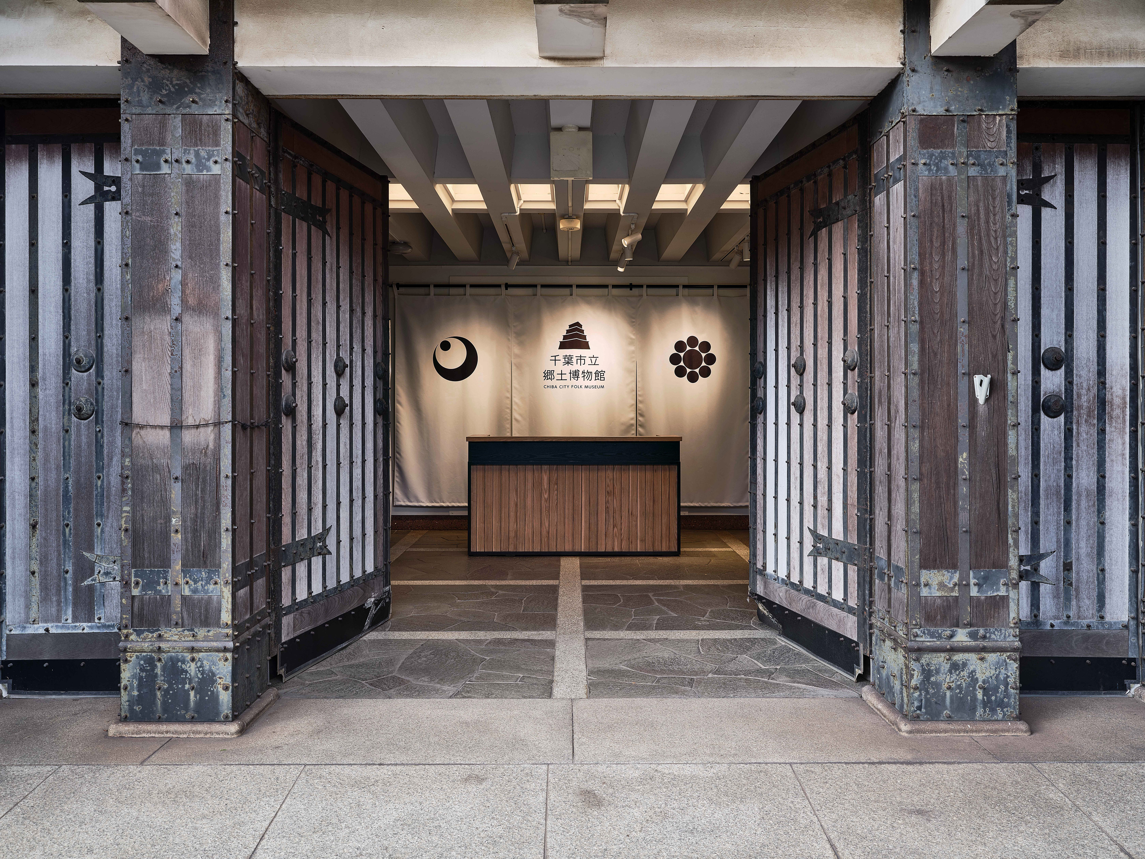
Chiba City Folk Museum
Logos, Visual Identity
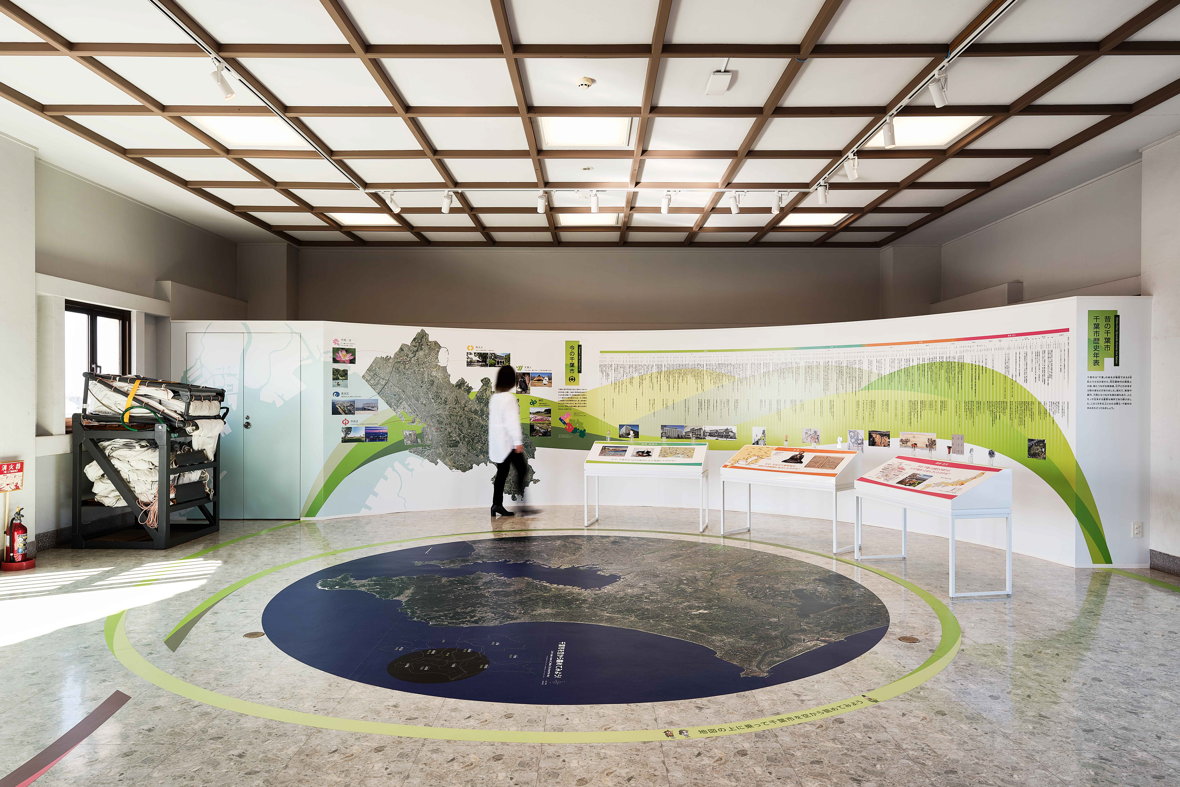
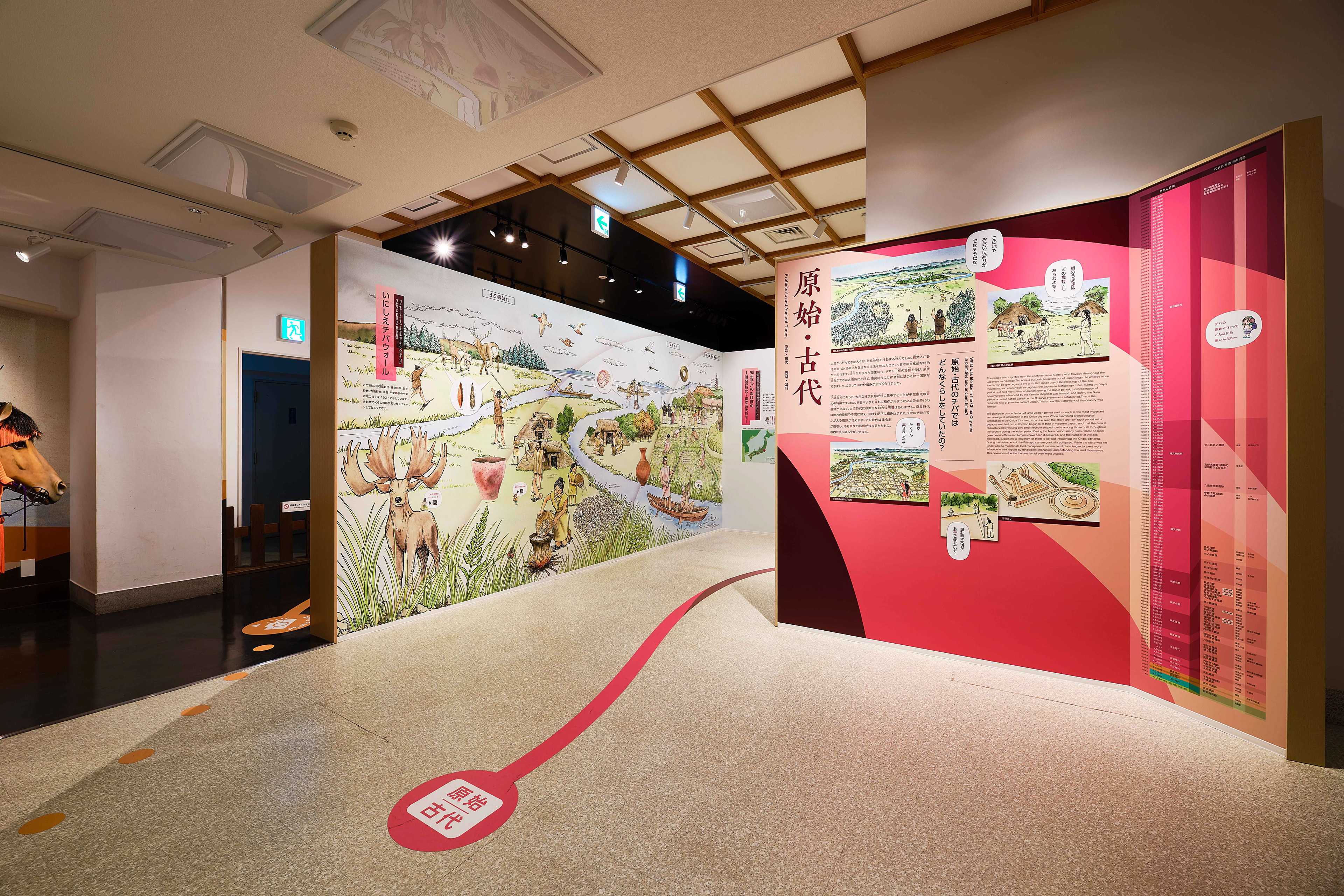
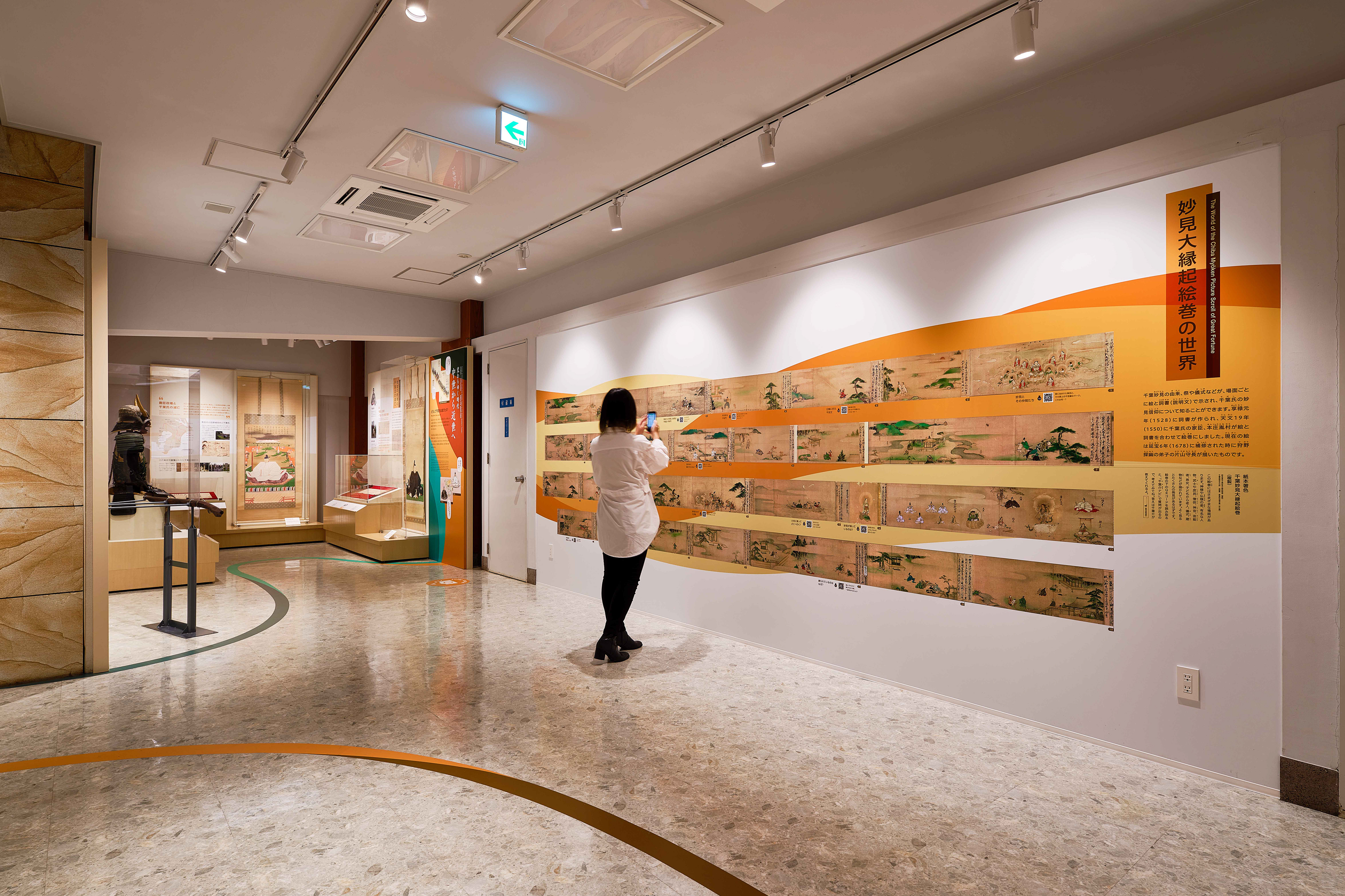
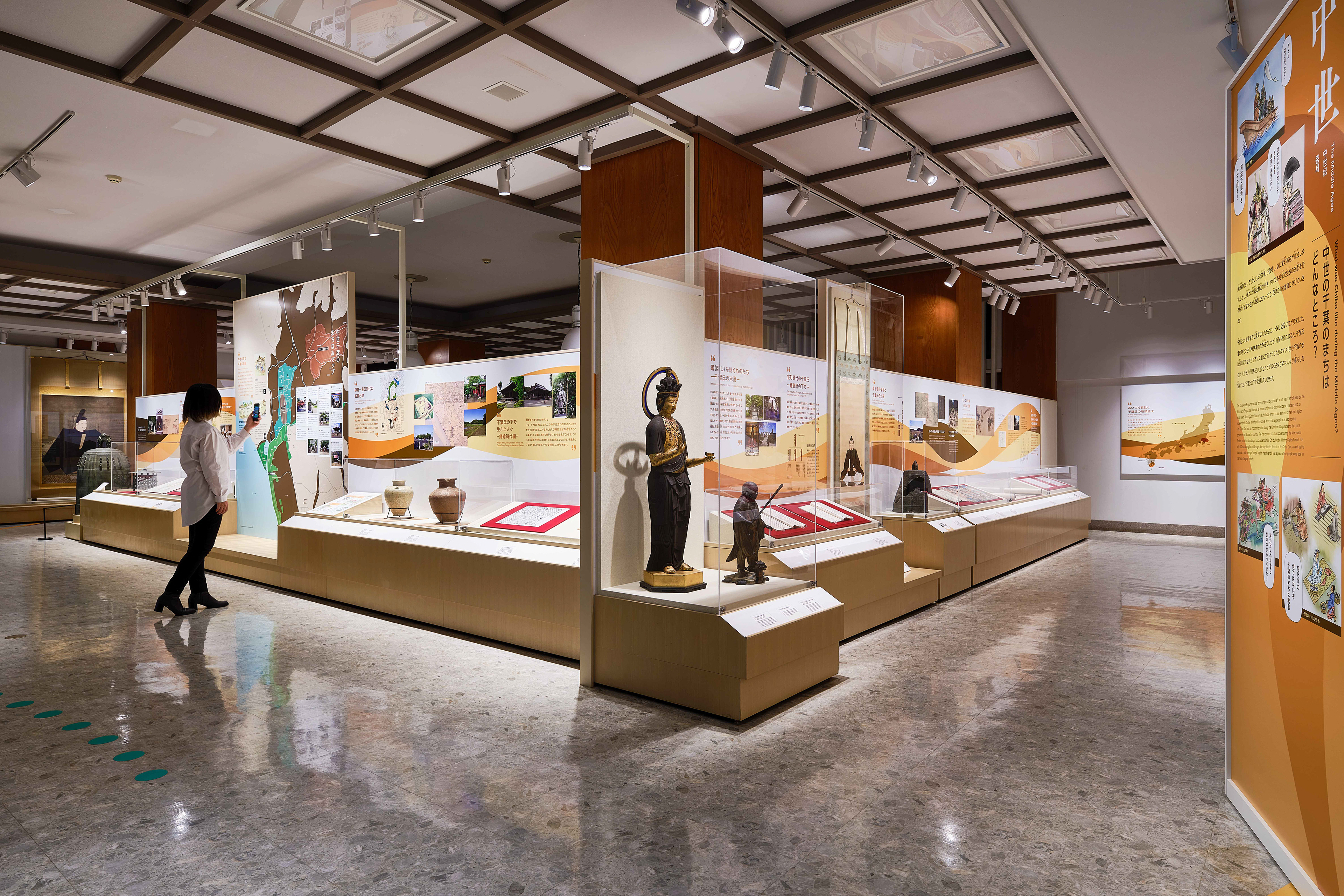
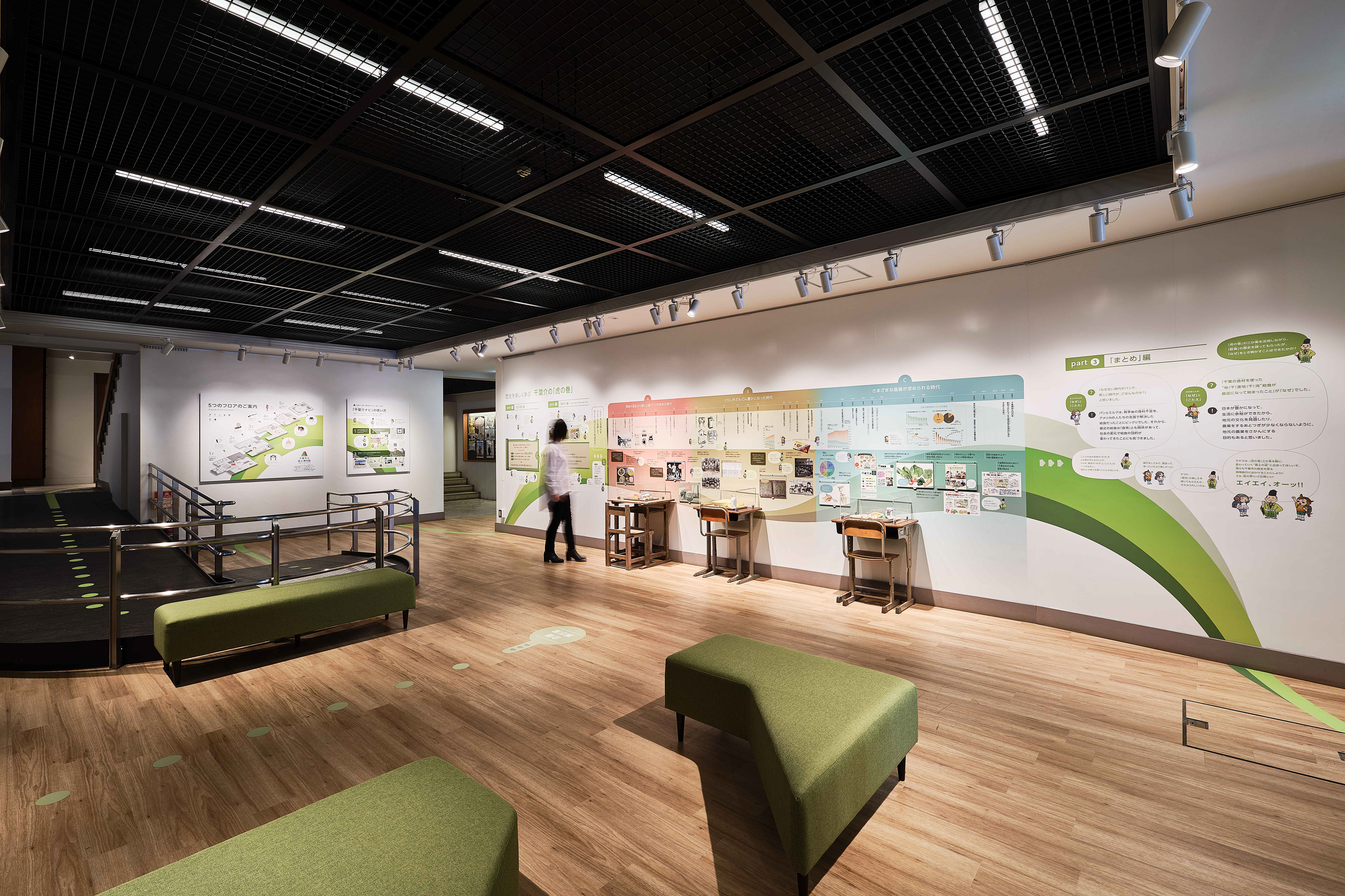
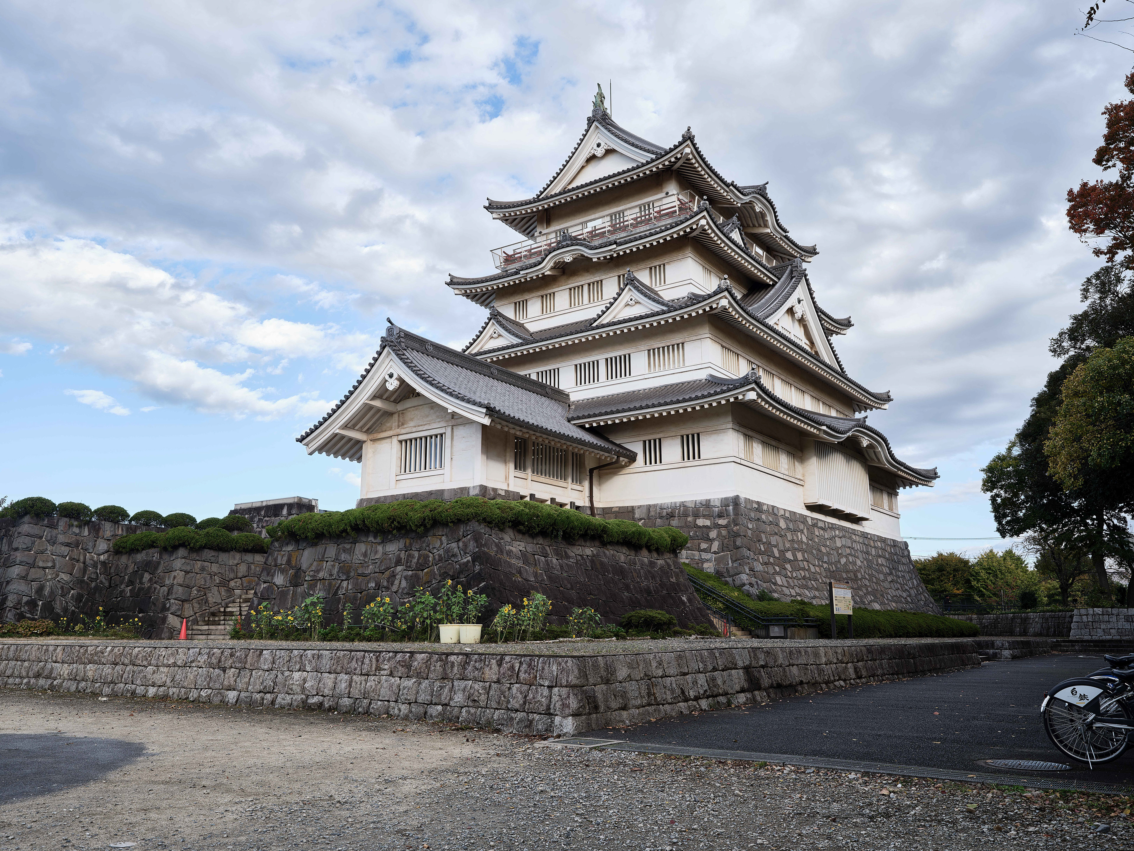
A museum that conveys the dynamic history and culture of Chiba prefecture. I designed the graphic themed to connect the past and present, and people and the museum. A colorful path named "Dynamic Line" which runs throughout the museum from the entrance to the exit lets visitors walk around and enjoy there. The colors of the path are based on the motif of “a variety of (=thousand)” leaves since the name of Chiba is made up of kanji characters "sen" meaning “thousand” and "ha" meaning "leaf." Four of the colors represent the era of Chiba: "New shoot” as modern and contemporary, "Green Leaves” as early modern period, “Beginning of Autumn” as Middle Ages, and “Autumn Leaves” as primitive and ancient times. The symbol mark represents the past, present, and future in a fun way, by combining the exterior of Inohana Castle with the pop colors of each era.
Name of facility: Chiba City Folk Museum
Client: Chiba City
Exhibition Design, planning, production and construction: TANSEISHA Co., Ltd.
Graphic designer: Shunpei Yokoyama
Photographer: Taira Kurihara
Client: Chiba City
Exhibition Design, planning, production and construction: TANSEISHA Co., Ltd.
Graphic designer: Shunpei Yokoyama
Photographer: Taira Kurihara