2016
Kawaii
Logos
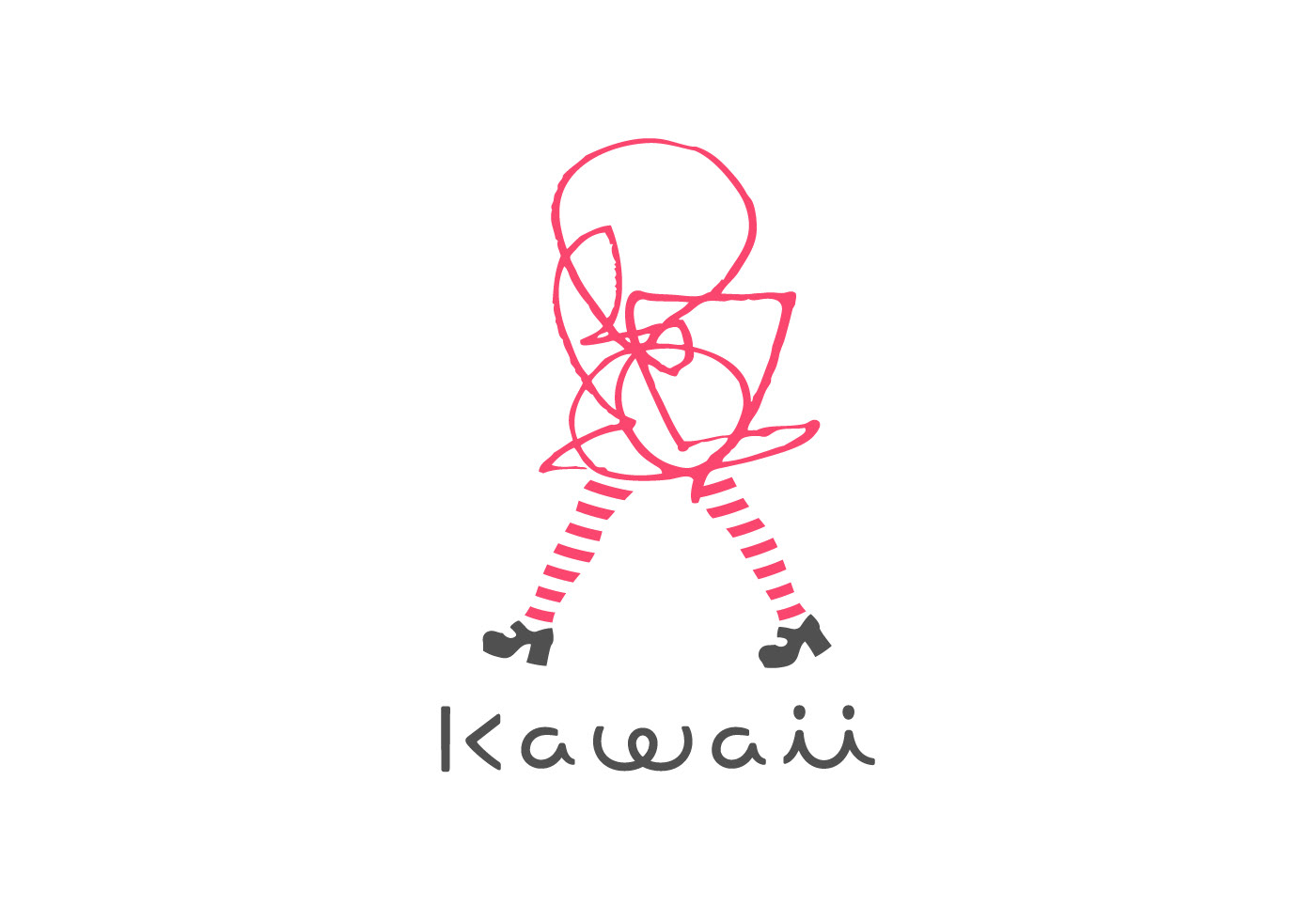
A new business that conducts a guiding service for inbound tourists to Tokyo with the keyword “kawaii” as their concept. I wondered why the word kawaii is so popular and used around the world, so I did research thoroughly before I started the design.
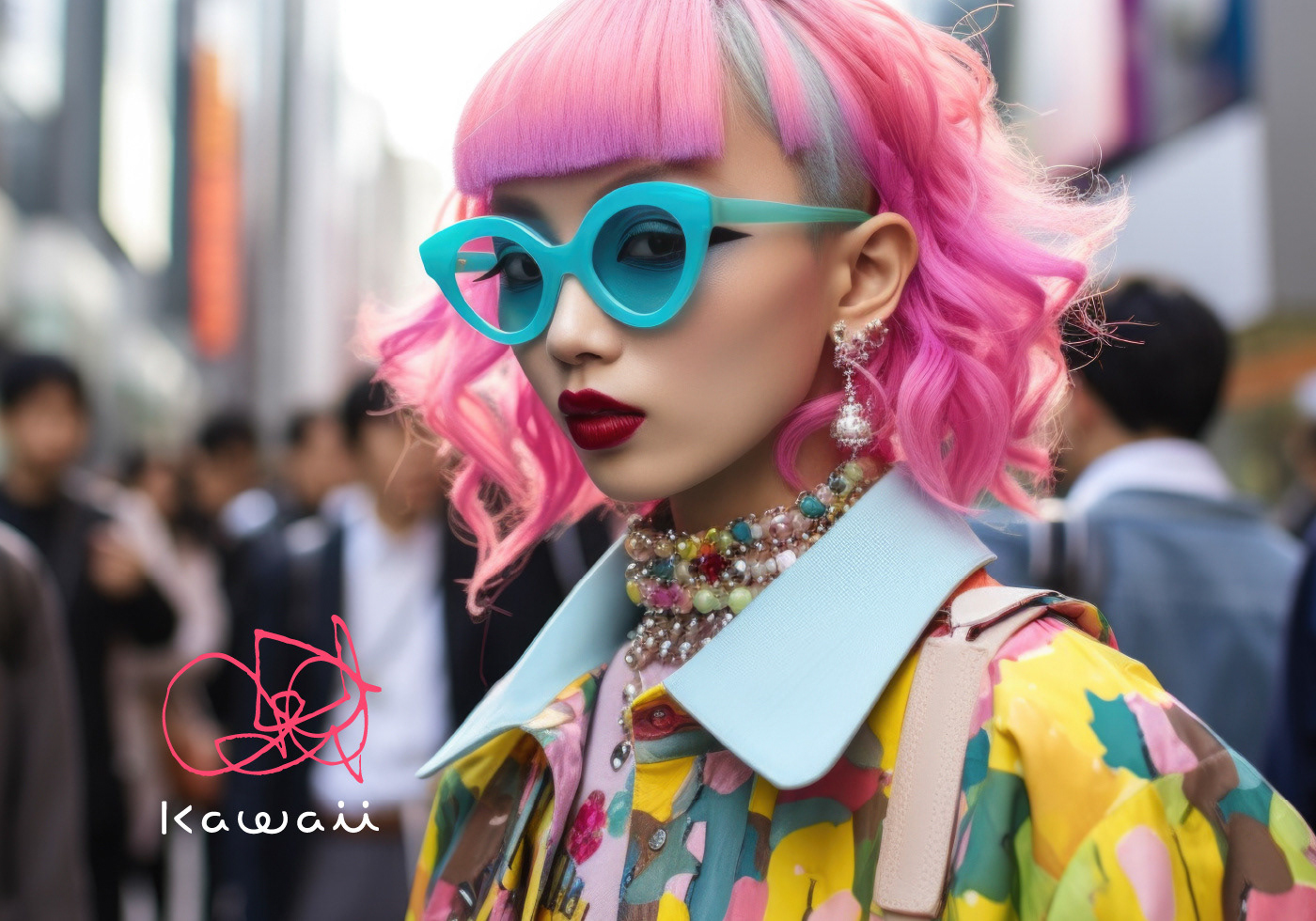
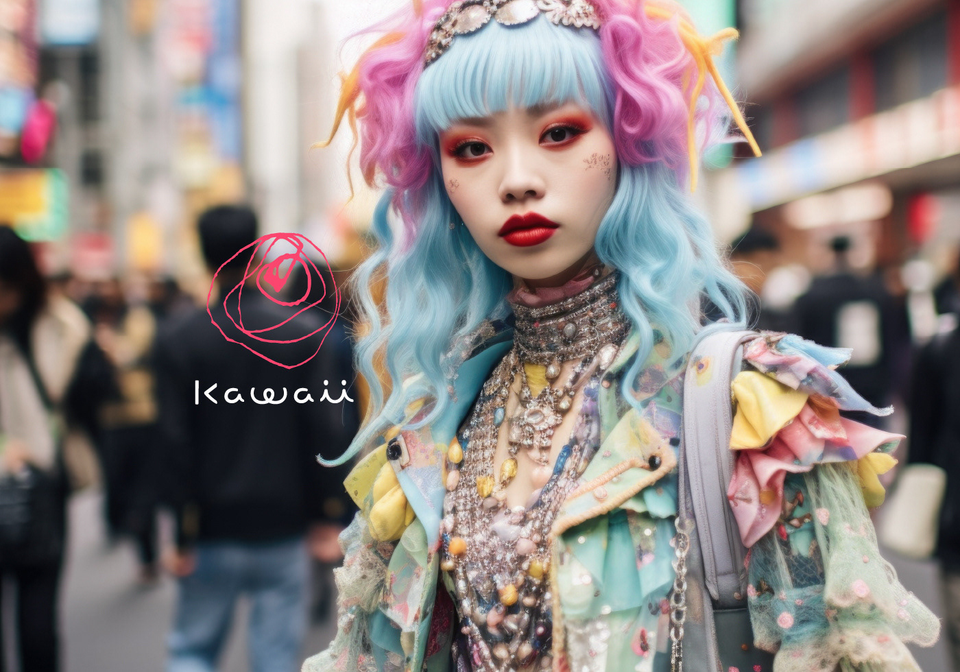
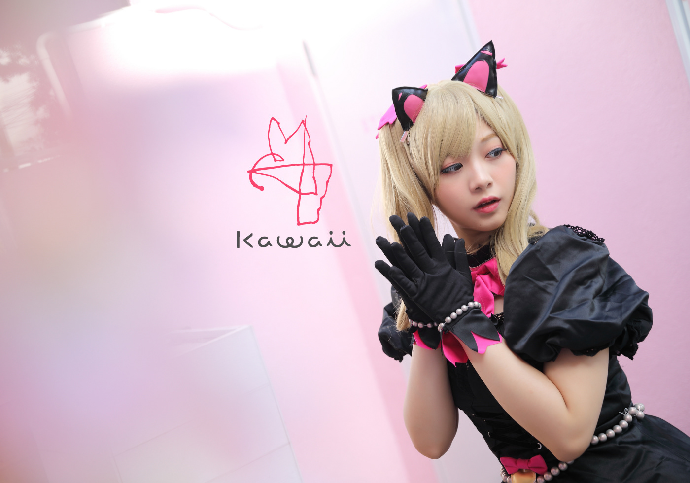
Kawaii has its origins in “kawaiso” (sorry) and “kanashii” (sad). It originally expressed a sort of sympathy and compassion for the state of being novice, immature, or incomplete. From there, it evolved into the idea of accepting and loving the immature state as it is. Thus this became established as the fundamental concept of kawaii. Kawaii is often translated as “cute”. But in comparison to its etymology, it has the opposite meaning to the English word, cute. Interestingly, the slang, “kimo kawaii” (kimo, meaning ugly or yucky), which has come to be used in recent years, logically matches the etymology and it can be said that the sense of wording of youth today can be spontaneously based on the origins. In western countries, which value maturity and independence, kawaii works uniquely as a word affirming immaturity and supporting a diverse, independent, and free way of life. The world resonates with the essential value of “accepting things as they are” with the use of kawaii.
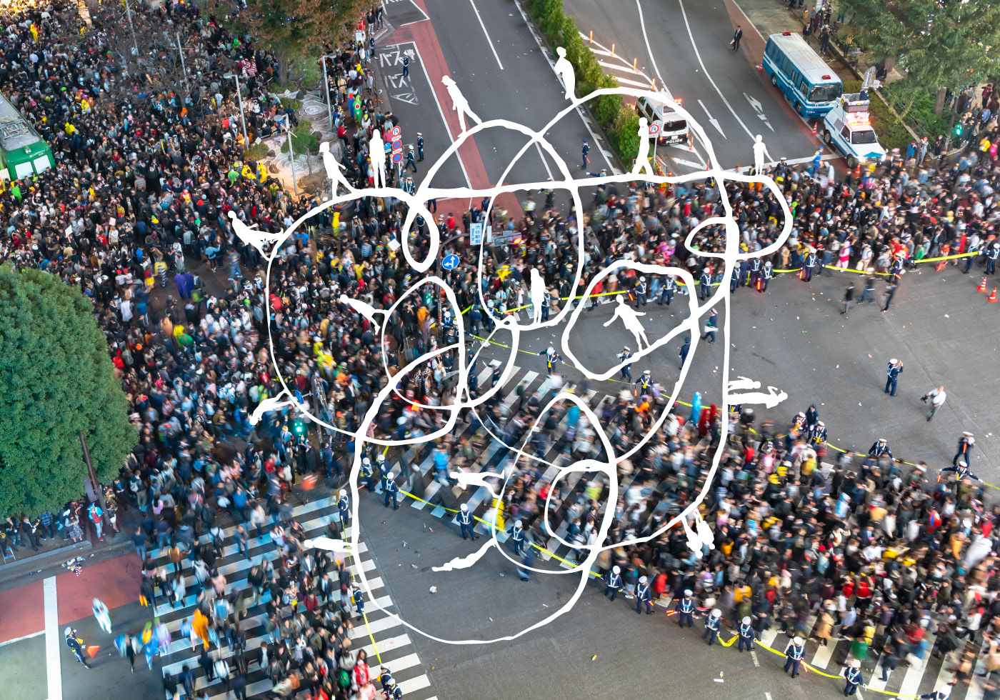
To launch Kawaii as a business to the world, we sought a new and open expression for the logo by avoiding a stereotypical tone and a conventional clear and easy-to-understand motif. This logo is rather incomplete and changes its shape freely. It represents the beginning of something positive or the present that continues to move. Its looseness depicts the sense that something new is emerging. This is precisely the message: to cherish a wide variety… diversity. And the female figure, which is: to value your own standard. Both are in contrast to the conventional social standards. This logo is the very concept of kawaii, that of stepping out into the world.
Kawaii has its origins in “kawaiso” (sorry) and “kanashii” (sad). It originally expressed a sort of sympathy and compassion for the state of being novice, immature, or incomplete. From there, it evolved into the idea of accepting and loving the immature state as it is. Thus this became established as the fundamental concept of kawaii. Kawaii is often translated as “cute”. But in comparison to its etymology, it has the opposite meaning to the English word, cute. Interestingly, the slang, “kimo kawaii” (kimo, meaning ugly or yucky), which has come to be used in recent years, logically matches the etymology and it can be said that the sense of wording of youth today can be spontaneously based on the origins. In western countries, which value maturity and independence, kawaii works uniquely as a word affirming immaturity and supporting a diverse, independent, and free way of life. The world resonates with the essential value of “accepting things as they are” with the use of kawaii.
To launch Kawaii as a business to the world, we sought a new and open expression for the logo by avoiding a stereotypical tone and a conventional clear and easy-to-understand motif. This logo is rather incomplete and changes its shape freely. It represents the beginning of something positive or the present that continues to move. Its looseness depicts the sense that something new is emerging. This is precisely the message: to cherish a wide variety… diversity. And the female figure, which is: to value your own standard. Both are in contrast to the conventional social standards. This logo is the very concept of kawaii, that of stepping out into the world.
Client: Blue Impact Co., Ltd.
Art Director / Designer: Shunpei Yokoyama
Art Director / Designer: Shunpei Yokoyama
—
「カワイイ」をキーワードにインバウンド向けに東京を案内する新しいビジネス。カワイイという言葉がなぜ浸透し、世界で使われるのか、デザインを始めるにあたり調査した。
語源を「可哀相」「悲しい」に持つ「カワイイ」。これはもともと「半人前、未熟、不完全な状態」に対して抱く同情やいたわりを表す。ここから「未熟な状態をありのまま受け入れ、愛おしむ」へと進化した。「cute」と訳されることが多いが、小悪魔的な可愛らしさとは逆の意味を持つ。また、「キモかわいい」という言葉は、実は語源に即したフレーズであり、今の若者の言葉使いのセンスは自然と日本語のルーツを踏まえているとも言える。そして自我の確立を求められる欧米において「Kawaii」は、半人前を肯定する魔法の言葉として、主体的で自由な生き方を応援する価値を持つ。
その「Kawaii」を世界へ向けた事業として掲げるにあたり、従来の「強く・わかりやすい」モチーフを用いて「特定のトーンで囲う」ことはせずに、新しくオープンな表現を模索した。このシンボルマークは不完全で、常にそのカタチを自由に変化させる。それは「ポジティブな何かのはじまり」や「動き続ける今現在」を表し、そのゆるさは「新しい何かが出現する気配」を表現している。これは正に「多種多様でいいんだ」とうメッセージであり、従来の社会構造に対する「自分だけの価値基準」を掲げる姿でもある。このシンボルマークは世界へ向けて歩き出す「Kawaii」という価値観そのものである。
クライアント: 株式会社ブルーインパクト
アートディレクター、デザイナー:横山俊平
アートディレクター、デザイナー:横山俊平