
2014
Creative Agency Hidekazu Kobayashi
Logos, Visual Identity
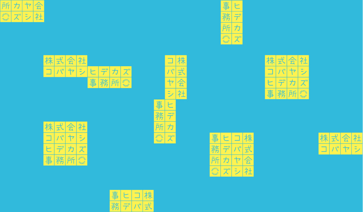
A logo and VI for a company specializing in copywriting. Inspired by the mission of copywriters to put thoughts into short words and phrases, the design motif of square manuscript papers was established, and I let one letter of the company name be assigned to each box. Their work, which crosses genres and flexibly responds to a wide variety of projects, is expressed through vertical and horizontal writing, as too with the logo that can be freely combined in various configurations. I believe that this is a rare format to countries where only horizontal writing is used.
Client: Hidekazu Kobayashi
Art Director / Designer: Shunpei Yokoyama
Art Director / Designer: Shunpei Yokoyama
—
コピーライターの専門集団のためのロゴとVI。「短い言葉に想いを込める」という仕事から、原稿用紙に一文字づつ社名をあてがうデザインとした。ジャンルを横断するクリエイティブを、縦書き横書き自由自在な組み合わせに対応するロゴで表現した。
クライアント: 株式会社コバヤシヒデカズ事務所
アートディレクター、デザイナー:横山俊平
アートディレクター、デザイナー:横山俊平