2009
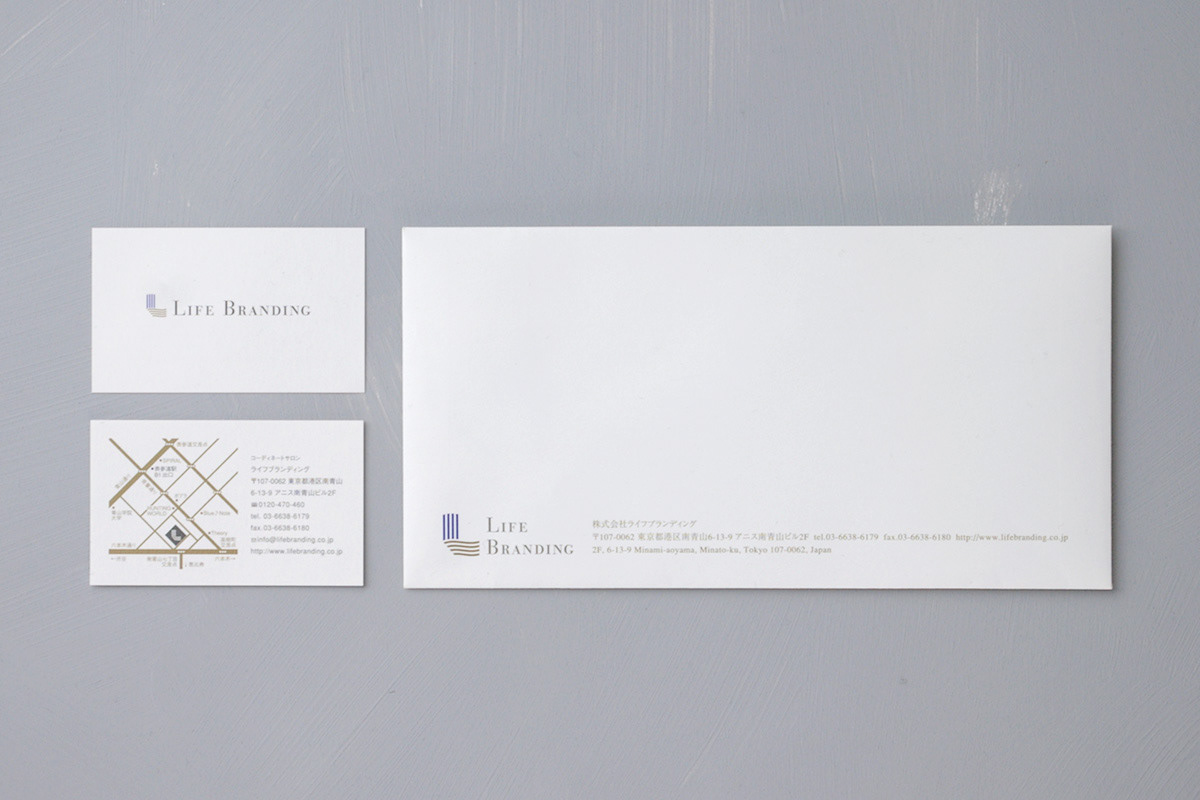
Life Branding
Logos, Corporate Identity
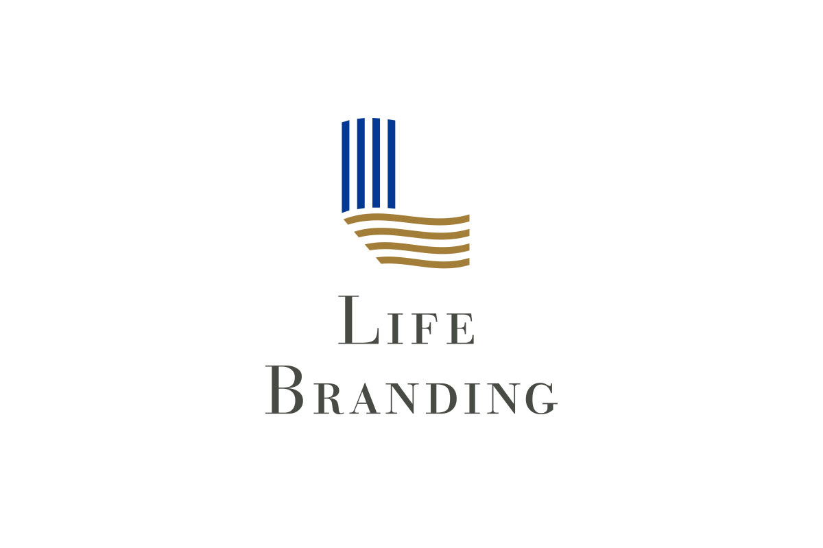
I designed according to the wishes and ideas of the four founding members of a “personal stylist” business. For the logo, the initial letter “L” of the company name is used as a motif. It represents that of a customer enjoying life positively with a depiction of a ship running in the wind. It also reflects the founders' active attitudes, which are always forward thinking. The four lines have the meaning of warp and weft, also evoking clothing, which are terms used in weaving. The folding of the vertical and horizontal lines expresses an inner beauty that is to be awakened as the customer's appearance changes.
Client: Life Branding Co., Ltd.
Art Director / Designer: Shunpei Yokoyama
Art Director / Designer: Shunpei Yokoyama
—
「パーソナルスタイリスト」という事業を立ち上げる創業メンバー4人の想いを図案化した。シンボルマークは社名の頭文字「L」をモチーフとし、風を受けて走る船をイメージしながら、人生をポジティブに楽しむ顧客の姿、そして常に前進するアクティブな姿勢を表す。4本のラインは縦糸・横糸となり服飾も連想させる。その縦と横のラインが折り返す様は顧客の外見が変わることによりその人の内面も輝いてくる姿も表現している。
クライアント: 株式会社ライフブランディング
アートディレクター、デザイナー:横山俊平
アートディレクター、デザイナー:横山俊平