2014
Mokkulu Shinshiro
Logos
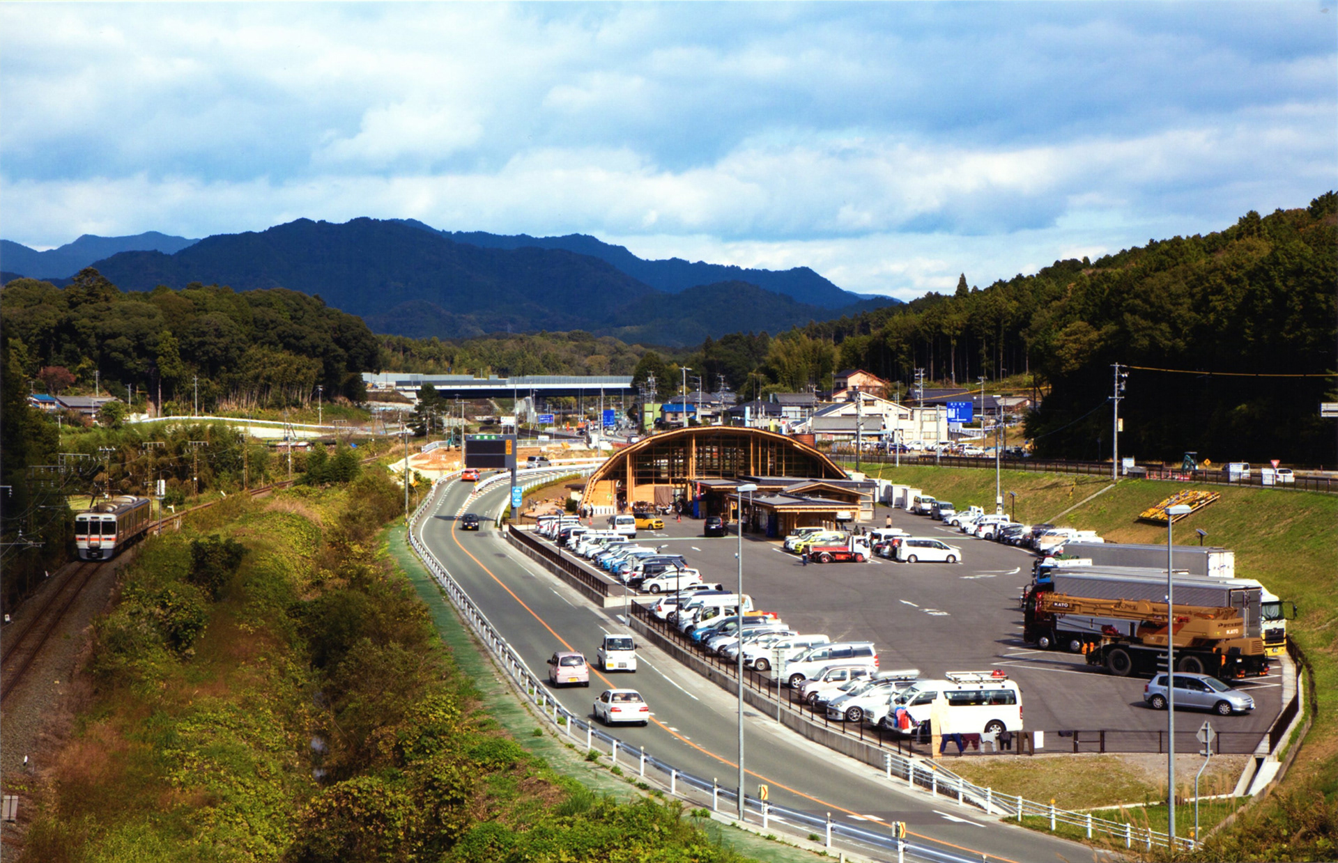
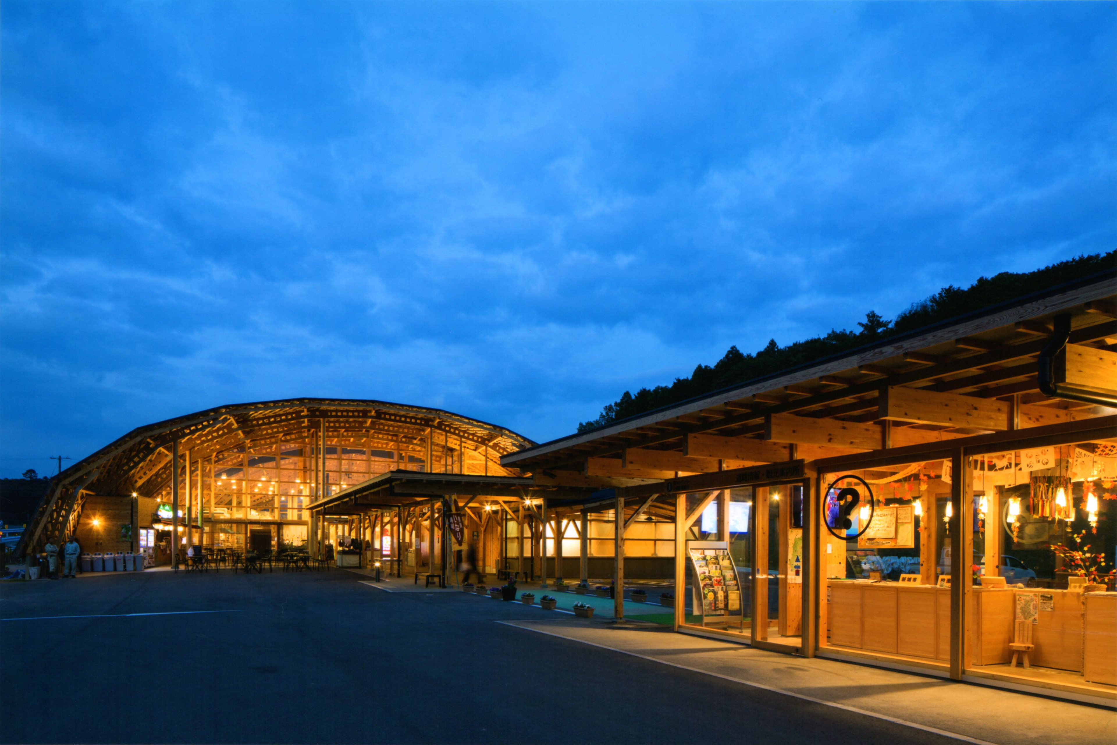
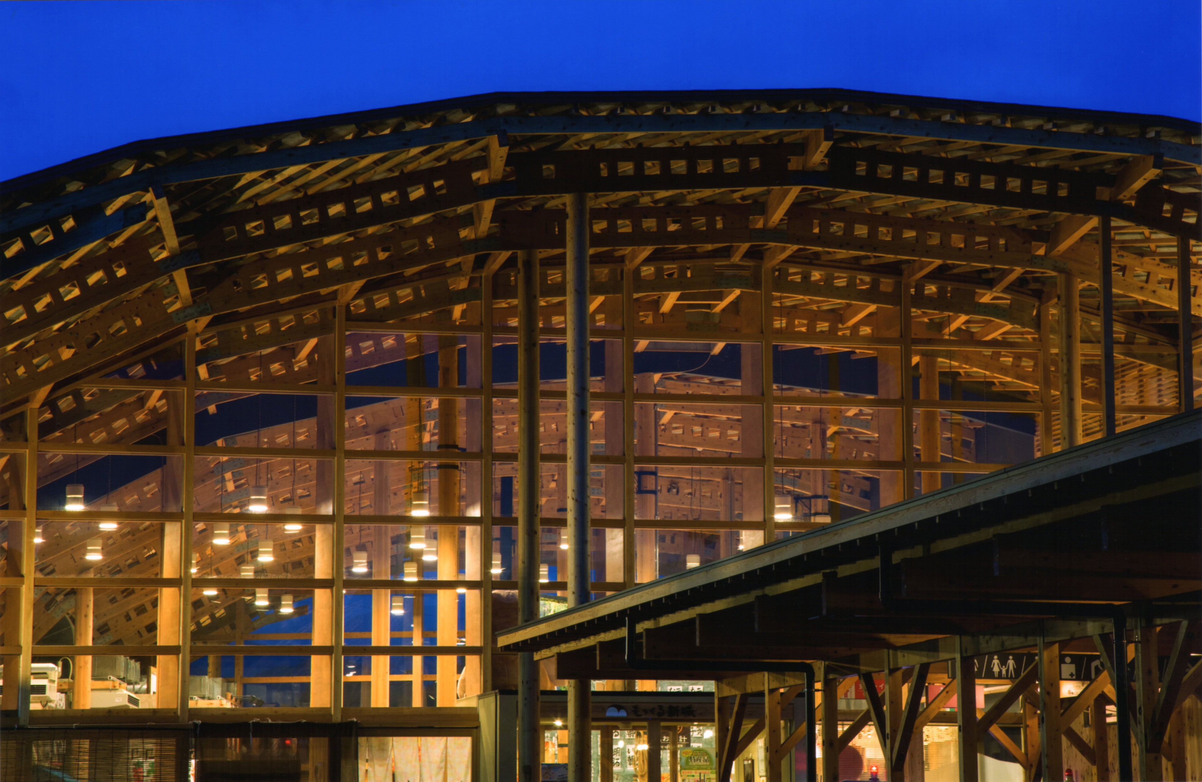
The city of Shinshiro in Okumikawa region is located on the eastern side of Aichi Prefecture near the border with Shizuoka Prefecture. Historically, it has been a transportation hub that has prospered as “a mountain port/hub” on the Ina Highway, and is also a place where locals have gathered and interacted since ancient times. Mokkulu Shinshiro is a “roadside station” newly established as a sightseeing hub and attraction in the area with a food court, retail space, a hot spring foot bath, to name a few of the facilities. The logo is inspired by the exterior of the facility, which has a large arched roof that is a characteristic of the wooden structure that stands out. In addition, the design is friendly and reminiscent of a “station” where many people come and go. The silhouette also represents the first letter of the facility name, “M”. The name Mokkulu was selected by public competition. “Moku” means “tree, wood”, and “kuru” means “come”. I used a handwritten typeface to cherish it as sounding warm and friendly as a rest facility.
Client: Shinshiro City
Architect: Tetsuya Ukai Architects
Graphic Designer: Shunpei Yokoyama
Photographer: Shin Shashin Kobo
Architect: Tetsuya Ukai Architects
Graphic Designer: Shunpei Yokoyama
Photographer: Shin Shashin Kobo
—
愛知県の東側、静岡との県境に位置する奥三河地方の新城市。歴史的にも伊那街道「山の湊」として栄えてきた交通の要衝であり、古くから地元民が集い交流してきた場所でもある。もっくる新城はそこに観光ハブステーションとして新設された道の駅。
シンボルマークは木造で特徴的なアーチ状の大屋根をもつ施設外観をモチーフとしつつ、同時に多くの人が行き交う「駅舎」もイメージさせる、わかりやすいデザインとした。そのシルエットは施設名称のアルファベット頭文字「M」も表している。一般公募により選出された施設名称「もっくる」とは、木材・来るの意味。ほっこりとした響きを大切に、また休憩施設として親しみを感じさせるため、手書きのタイプフェイスとした。
シンボルマークは木造で特徴的なアーチ状の大屋根をもつ施設外観をモチーフとしつつ、同時に多くの人が行き交う「駅舎」もイメージさせる、わかりやすいデザインとした。そのシルエットは施設名称のアルファベット頭文字「M」も表している。一般公募により選出された施設名称「もっくる」とは、木材・来るの意味。ほっこりとした響きを大切に、また休憩施設として親しみを感じさせるため、手書きのタイプフェイスとした。
クライアント: 新城市
設計:鵜飼哲矢事務所
グラフィックデザイナー:横山俊平
撮影 : 新写真工房 堀内広治
設計:鵜飼哲矢事務所
グラフィックデザイナー:横山俊平
撮影 : 新写真工房 堀内広治