2014
Naruko Tenjinsha Shrine
Logos, Visual Identity
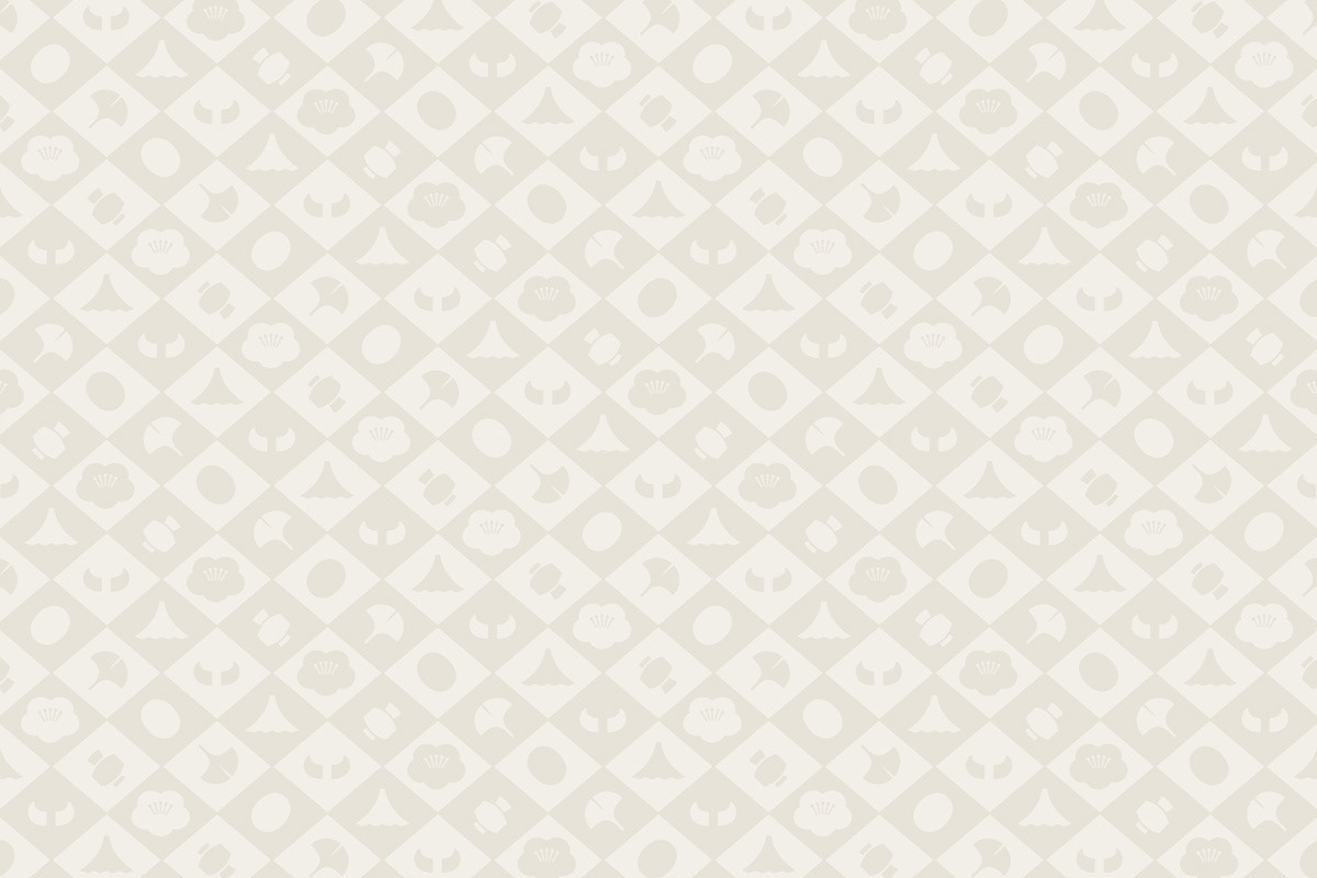
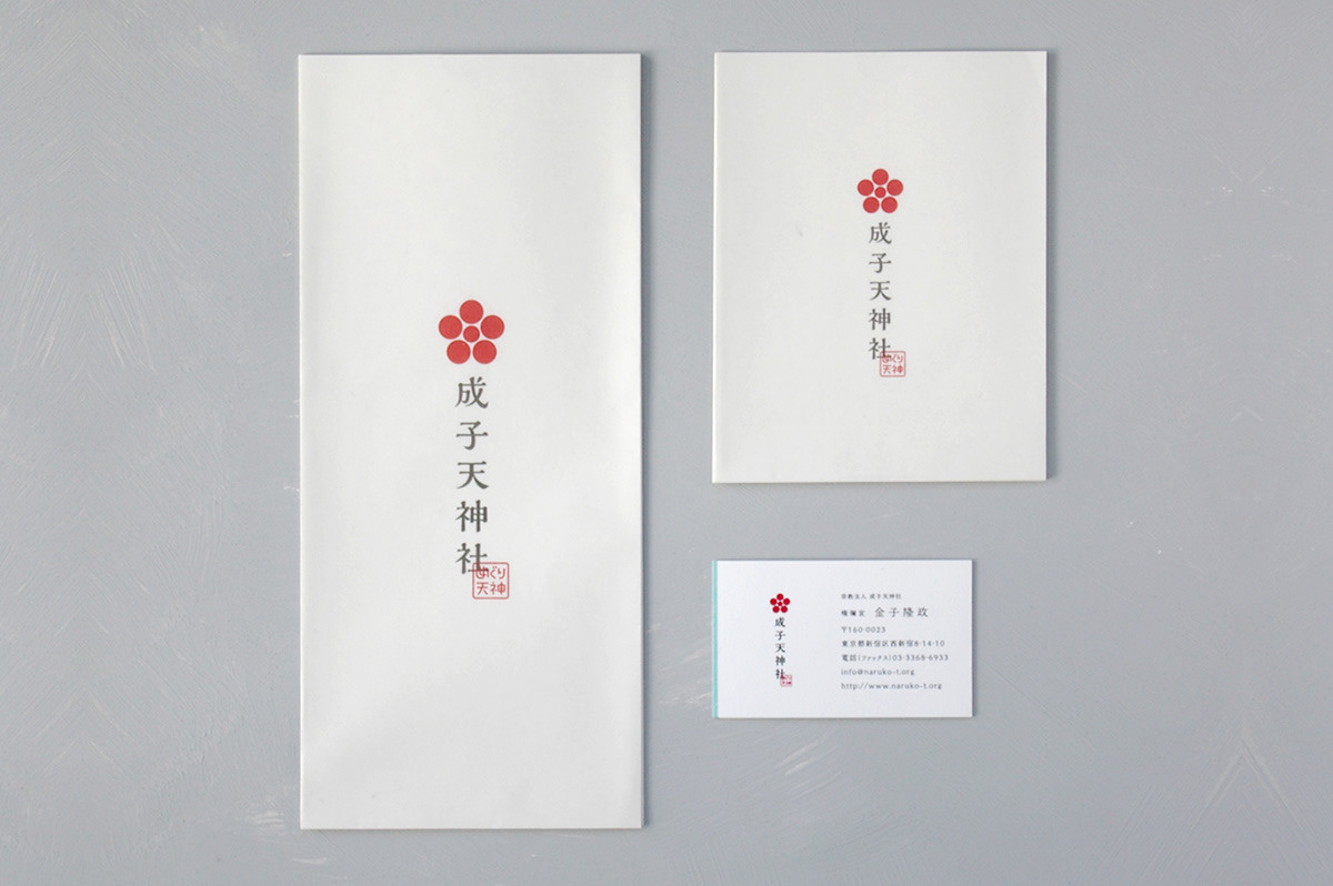
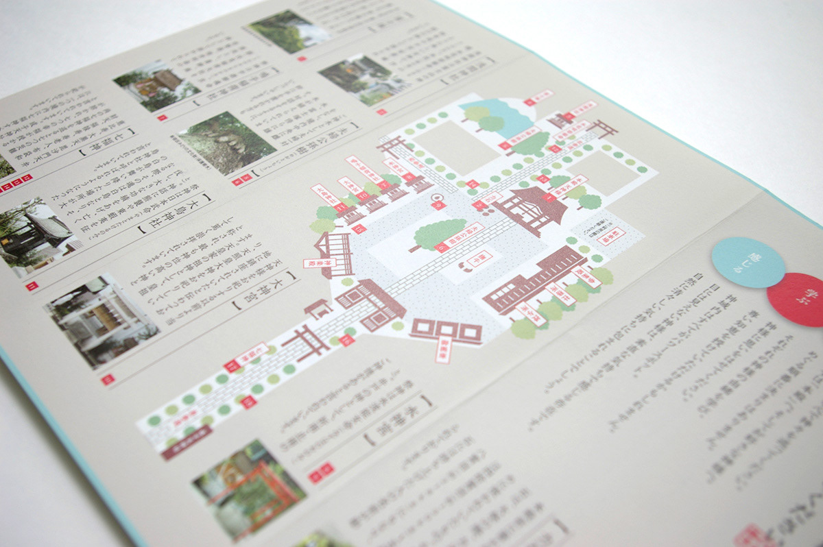
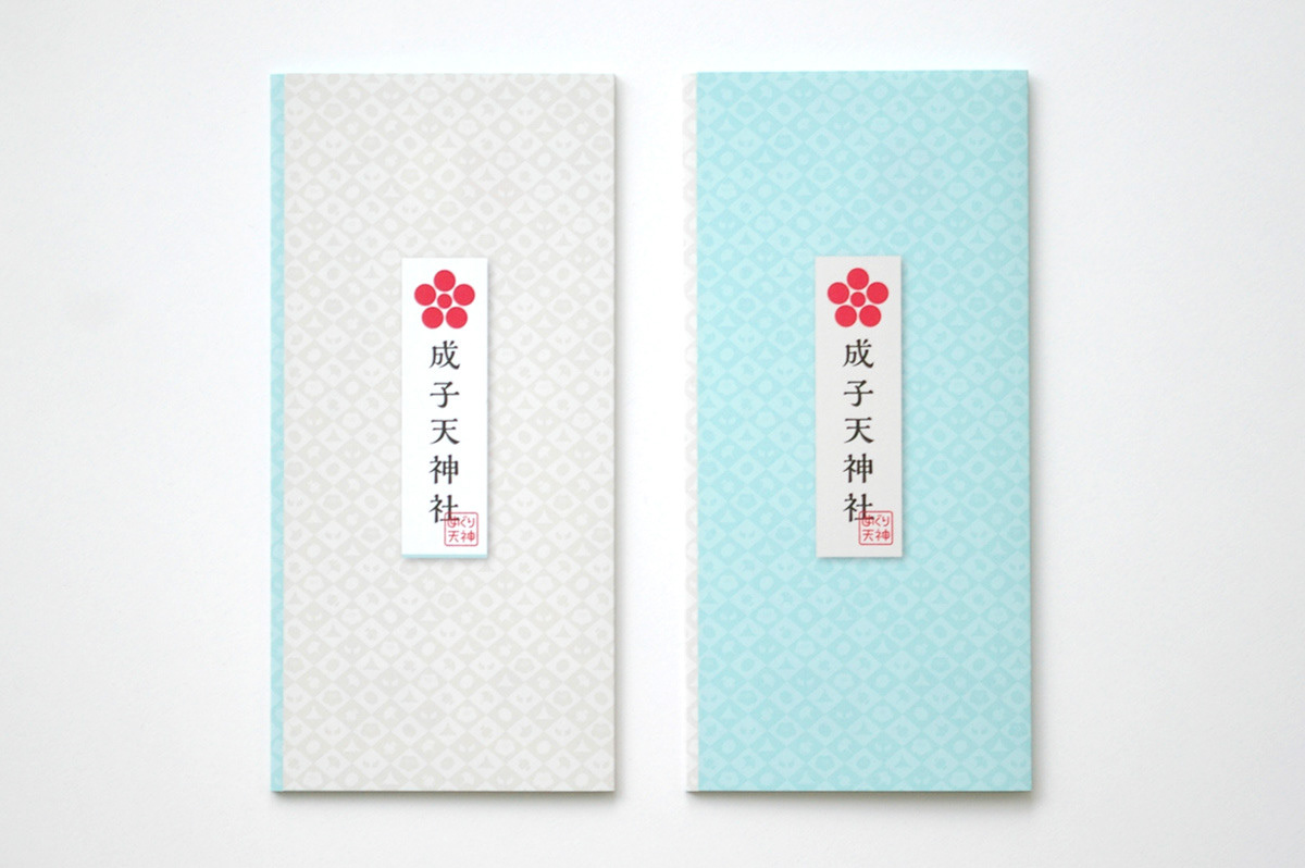
A shrine with a history of over 1,000 years in the heart of Tokyo, Nishi-Shinjuku, and surrounded by skyscrapers. Not only is the god Tenjin enshrined there, but also there are other highlights, such as a sacred mound, the Seven Deities of Good Luck, a statute of the messenger to the god, and many more on its grounds. We arranged them in a certain order, as if a pilgrimage to a place named, “Meguri-Tenjin”, that visitors can tour from spot to spot. I chose ecru, plum-red, and pale blue as the fundamental theme colors for the design. Ecru represents: to tour gods with pure hearts. Plum-red depicts the god of Tenjin, a god of study. Clear pale blue was chosen for “feeling invisible power”. Furthermore, by iconizing the highlights and using them as graphic patterns for leaflets, stationary, and the web, it implies that there are many gods to visit in the grounds of Meguri-Tenjin.
Client: Naruko Tenjinsha Shrine
Planning / Producer: EAST JAPAN MARKETING & COMMUNICATIONS, INC.
Art Director / Designer: Shunpei Yokoyama
Copy Writer:: Hidekazu Kobayashi
Planning / Producer: EAST JAPAN MARKETING & COMMUNICATIONS, INC.
Art Director / Designer: Shunpei Yokoyama
Copy Writer:: Hidekazu Kobayashi
—
成子天神社
高層ビルに囲まれた西新宿にある、千年を超える歴史を持つお社。境内には天神様だけでなく様々な神様が祀られているほか、富士塚・七福神・力石・撫牛(なでうし)など数多くの見所があり、それらを「めぐり天神」と名付けて境内を整備した。テーマカラーとして、まっさらな心で神々を“巡る”を「生成色」、“学ぶ”を天神様ゆかりの「梅紅色」、見えない力を“感じる”を富士の空を表す「淡青色」を掲げた。さらに様々な見所をアイコン化しグラフィックパターンとして、リーフレット・名刺・封筒・webなどに展開することで、たくさんの神様がいる「めぐり天神」であることをわかりやすく発信している。
クライアント: 成子天神社
企画・プロデューサー:ジェイアール東日本企画
アートディレクター、デザイナー:横山俊平
コピーライター:コバヤシヒデカズ
企画・プロデューサー:ジェイアール東日本企画
アートディレクター、デザイナー:横山俊平
コピーライター:コバヤシヒデカズ