2023
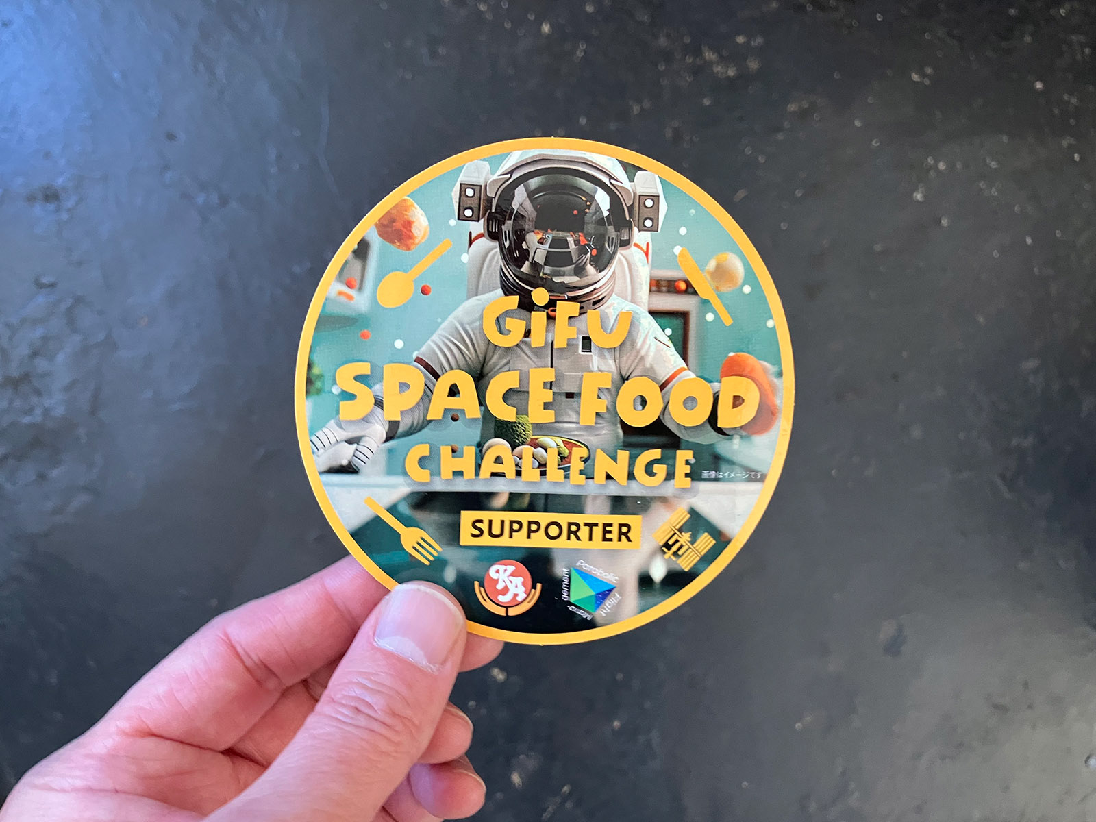
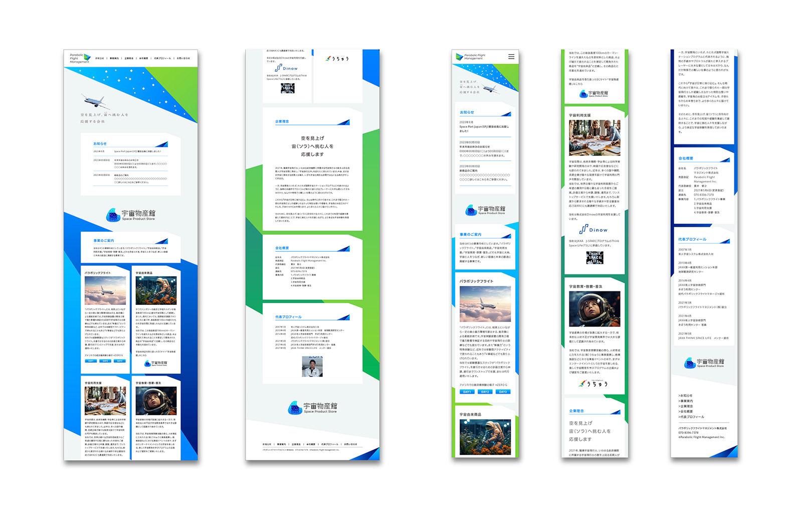
Parabolic Flight Management
Logos, Visual Identity
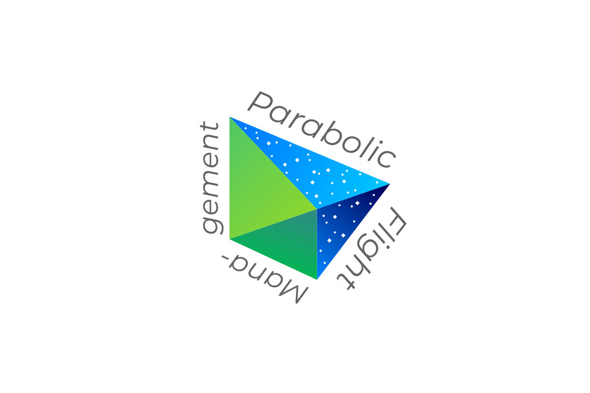
A symbol mark represents to support those who takes on the challenge of space. I chose a "paper airplane" as a motif for a symbol of childhood dreams. It expresses the excitement of looking up at the sky and the idea that space is an extension of that dream. As space becomes closer than before, the symbol mark sends out a message that the experiences and feelings that only astronauts have had until now will be opened and shared to the public. The green part on the left side of the mark represents the earth, and the other part blue for space. These two parts symbolize the company's role of connecting people and space.
Client: Parabolic Flight Management Inc.
Art Director / Designer: Shunpei Yokoyama
Art Director / Designer: Shunpei Yokoyama
—
パラボリックフライトマネジメント
空を見上げ、宇宙へ挑む人を応援するシンボルマーク。幼い頃の夢の象徴として「紙ヒコーキ」をモチーフとして、空を見上げてワクワクする気持ち、その夢の延長線上に宇宙があるという姿勢を表す。これから宇宙が身近な存在になる、そんな時代に向けて、今まで宇宙飛行士しか経験しえなかった体験・想いを、より多くの人々に届けてゆく、というメッセージを発信する。マーク左側の緑色部分は大地を、マーク右側の青色部分は宇宙を表し、この会社の「人と宇宙をつなげる役割」を表現している。
クライアント: パラボリックフライトマネジメント株式会社
アートディレクター、デザイナー:横山俊平
アートディレクター、デザイナー:横山俊平