2016
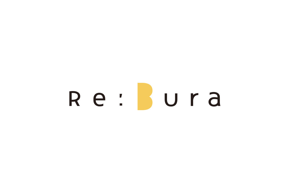
Re:Bura
Logos, Visual Identity
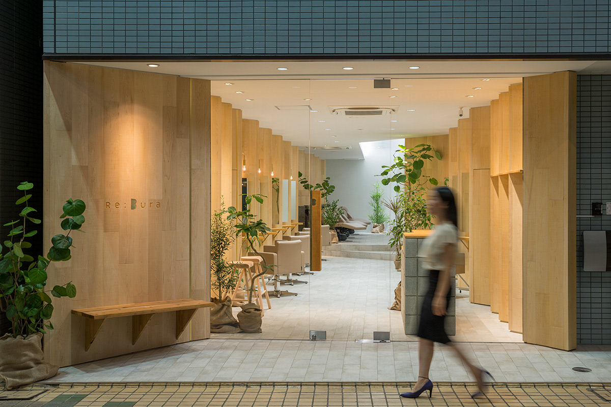
A community-based beauty salon located in the center of a shopping district. Their concept is that anyone can swing by anytime, like a coffee stand. A bench is installed at the entrance as a place to rest, contributing to the shopping district. Various ingenuities have been applied to make the salon a friendly place. “Bura” comes from “burabura” in Japanese, which is identical to “ramble”. The interior was designed with that concept in mind for the walkway that continues from the street to the back. It makes you want to pop in while taking a stroll. The salon's name, Re; Bura, was derived through these ideas. As a symbol of burabura, a “B” is used for the logo with a warm color and gentle form. By emphasizing the rhythm of spacing the letters apart, the sound of the store name when we hear it, and the impression of the interior (that makes use of warm wood), we are left feeling that they are all in alignment.
Client: Re;Bura
Interior design: Yamazaki Kentaro Design Workshop
Art Director / Designer: Shunpei Yokoyama
Interior design: Yamazaki Kentaro Design Workshop
Art Director / Designer: Shunpei Yokoyama
—
誰でも「銭湯のように毎日立ち寄れる」ことを目指す、商店街のちょうど中心に位置する地域密着型の美容室。エントランスにベンチを設置し、商店街に休憩スペースを提供している。通りからそのまま店の奥へ路がつながる印象の内装、散歩の途中にぶらりと立ち寄りたくなる、そんな気持ちから「レブラ」と名付けた。そのブラブラする象徴として「B」をほっこりとしたやさしいフォルムでシンボルマークとした。文字の間隔をあけてリズムを強調し、名称の響きや内装の連続する角材と印象を揃えている。
クライアント: Re;Bura
設計:山﨑健太郎デザインワークショップ
アートディレクター、デザイナー:横山俊平
設計:山﨑健太郎デザインワークショップ
アートディレクター、デザイナー:横山俊平