2022
Re;Tsugi
Logos, Visual Identity
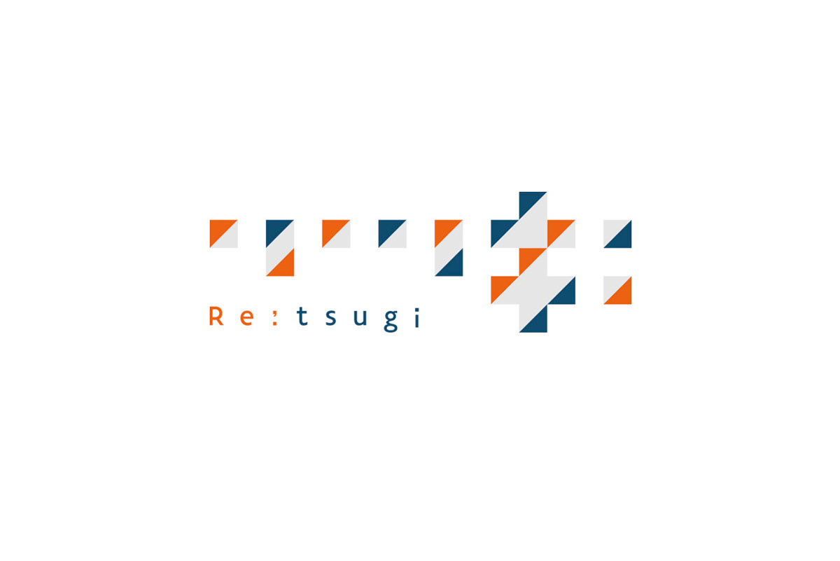
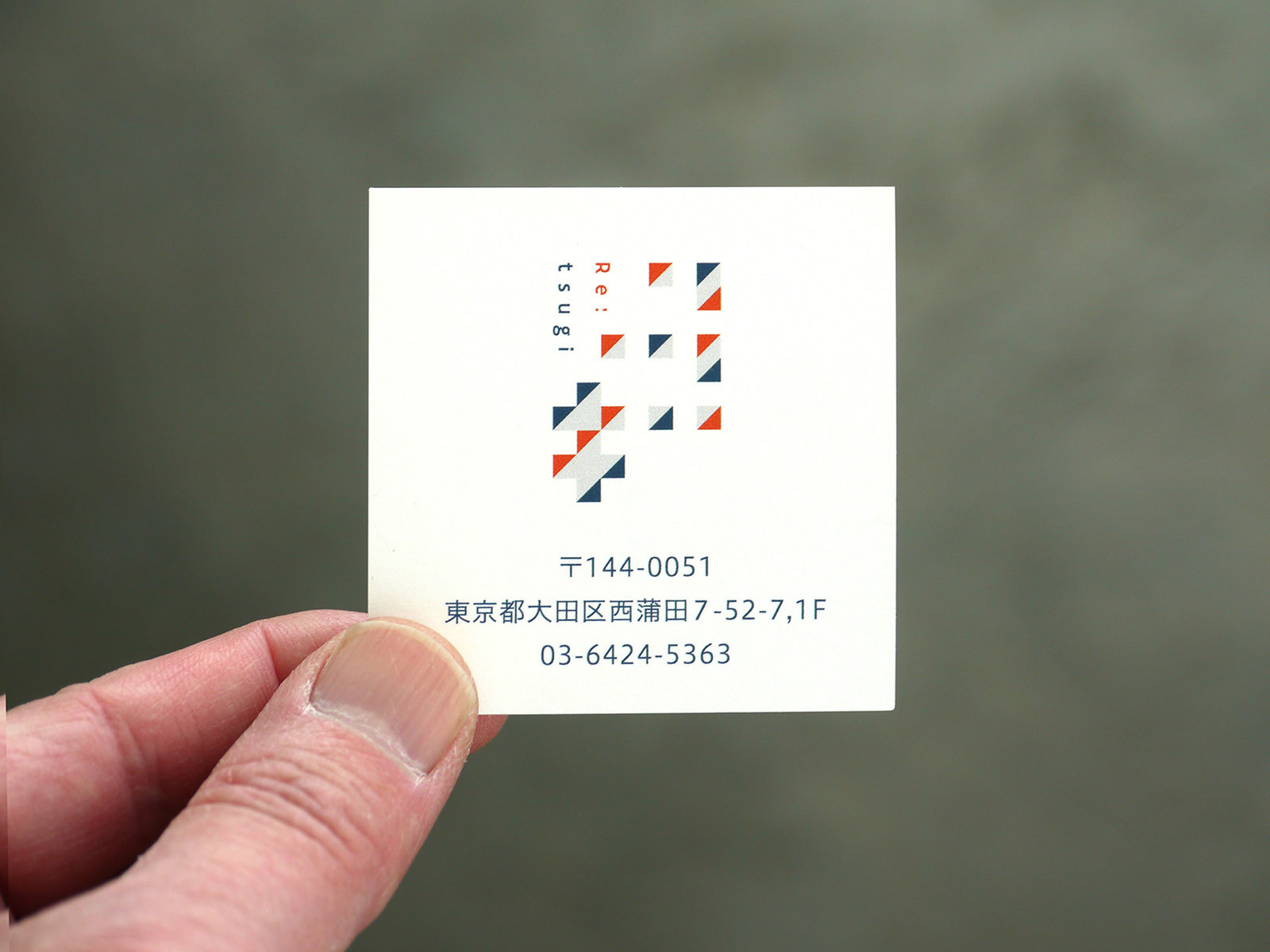
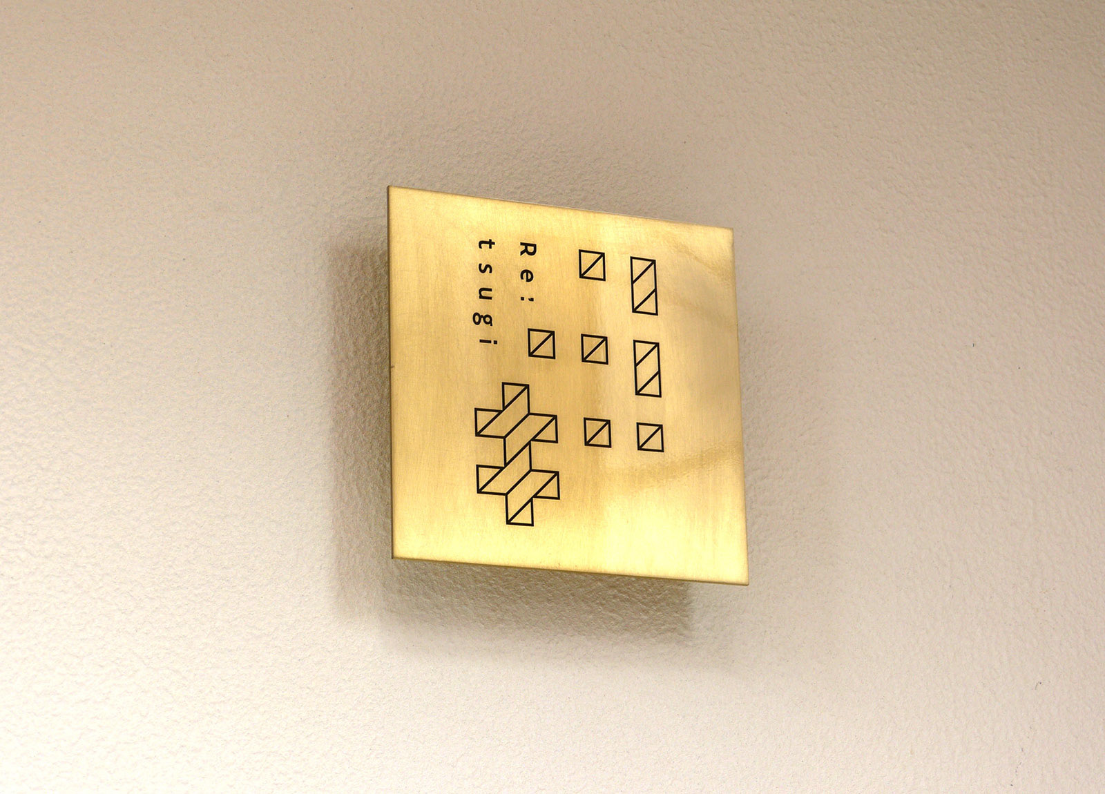
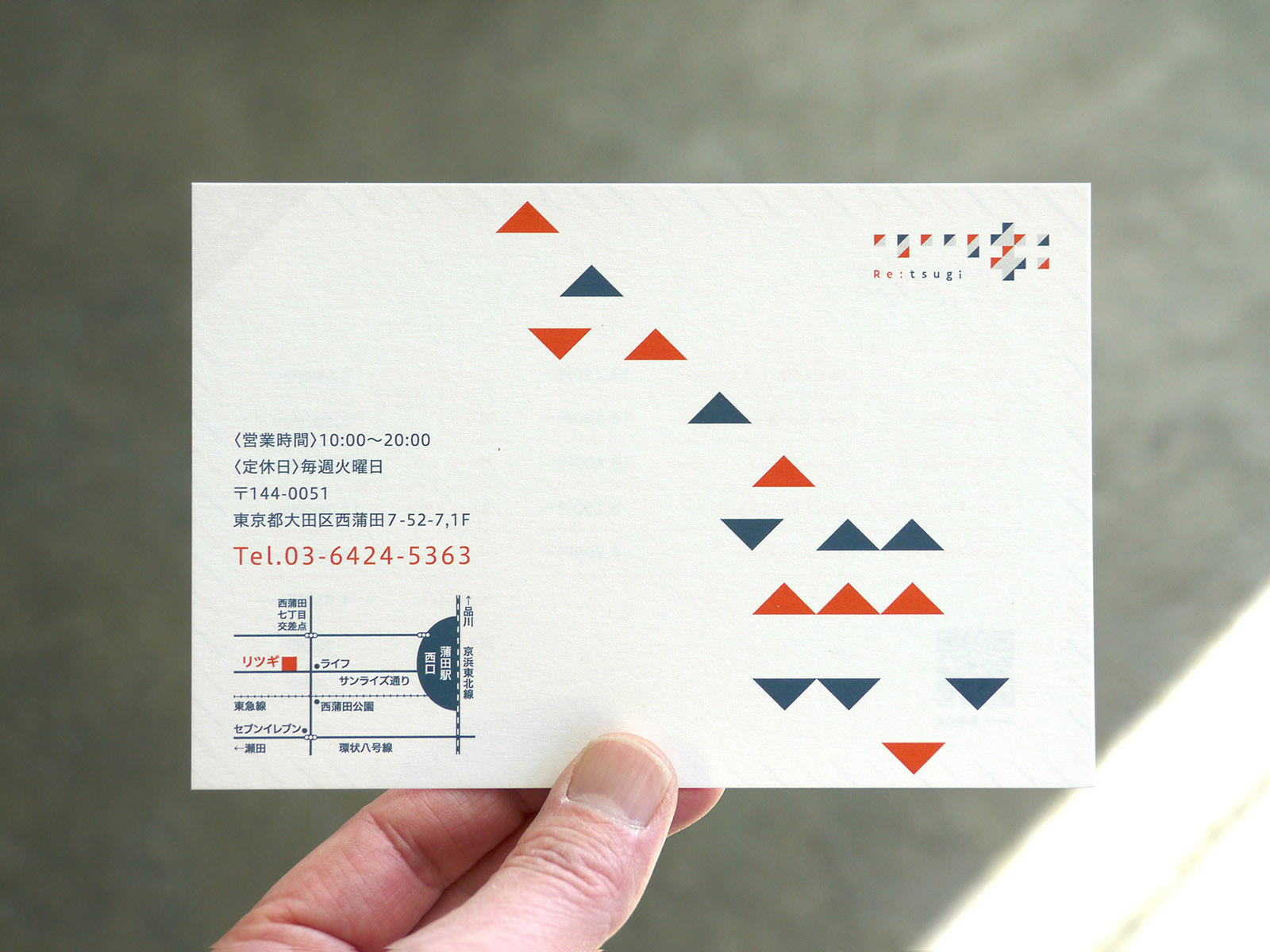
A beauty salon that promotes the feeling of achieving a new self and going to the next stage that is even reflected in the salon’s name. The beautiful sound of the name, Re:Tsugi (Re: Next) is expressed with a pattern that makes use of the rhythm and form of katakana lettering. At first glance, the entrance of the salon seems closed in, but when you go further inside, the impression changes to that of an open space. Similarly, the logo is a bit difficult to read at first glance, which uses a metaphor for feeling “private”, but once you read it, it becomes apparent, which also implies feeling “open”. It expresses discovering a sense of change from what wasn’t apparent initially.
In addition, as a place where customers are reborn anew, the changes before coming to the salon and then after coming are expressed with colors by switching between light and dark ones, and warm and cold ones.
In addition, as a place where customers are reborn anew, the changes before coming to the salon and then after coming are expressed with colors by switching between light and dark ones, and warm and cold ones.
Client: Re;Tsug
Interior designer: Bathyscaphe
Art Director / Designer: Shunpei Yokoyama
Interior designer: Bathyscaphe
Art Director / Designer: Shunpei Yokoyama
—
「次の自分・次のステージへ進む気持ち」を掲げた美容サロン。名称の綺麗な音の響きを、リズムを活かしたパターンと、カタカナのフォルムで表現した。
初見の読みにくい(プライベート)印象から、一度読めばわかりやすい印象(オープン)へと変化する感覚は、「見えそうで見えない場所」という空間のコンセプトと連動している。そしてお客様がサロンに来る前(before)と、サロンを後にする時(after)の変化を明と暗・暖色と寒色に切り替わるカラーで暗示している。
初見の読みにくい(プライベート)印象から、一度読めばわかりやすい印象(オープン)へと変化する感覚は、「見えそうで見えない場所」という空間のコンセプトと連動している。そしてお客様がサロンに来る前(before)と、サロンを後にする時(after)の変化を明と暗・暖色と寒色に切り替わるカラーで暗示している。
クライアント: Re;Tsug
内装設計:Bathyscaphe
アートディレクター、デザイナー:横山俊平
内装設計:Bathyscaphe
アートディレクター、デザイナー:横山俊平