
2025
Shimbashi Nan'o Park Clinic
Logos
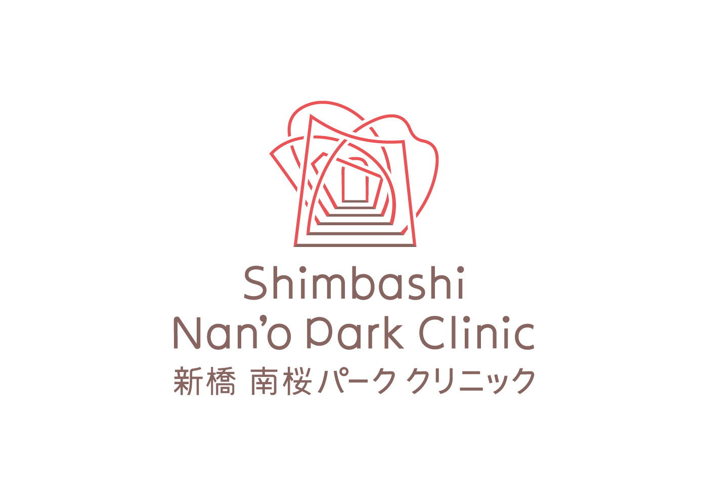
A symbol mark represents the clinic's honest approach to patients of various types and needs. The symbol mark that reminds of a tunnel of cherry blossom evokes Nan’o Park, right in front of the clinic, and the heart to support the local community. For a typeface, I used two colors to express vitality: a soft cherry blossom pink and a vibrant trunk brown.
Client: Shimbashi Nan'o Park Clinic
Art Director / Designer: Shunpei Yokoyama
Art Director / Designer: Shunpei Yokoyama
—
新橋 南桜パーク クリニック
感染症の第一人者である院長が、様々な患者さんとまっすぐ向き合う姿を表したシンボルマーク。桜のトンネルにも見えることからクリニック正面に広がる南桜公園を想起させて地域を大切にする想いを発信している。名称の書体は誠実な佇まいのタイポグラフィ。柔らかい桜の色と、生命力に満ちた幹の茶色の2色で構成している。
クライアント: 新橋南桜パーククリニック
アートディレクション、デザイン:横山俊平
アートディレクション、デザイン:横山俊平