2015
Tecarat
Logos, Visual Identity
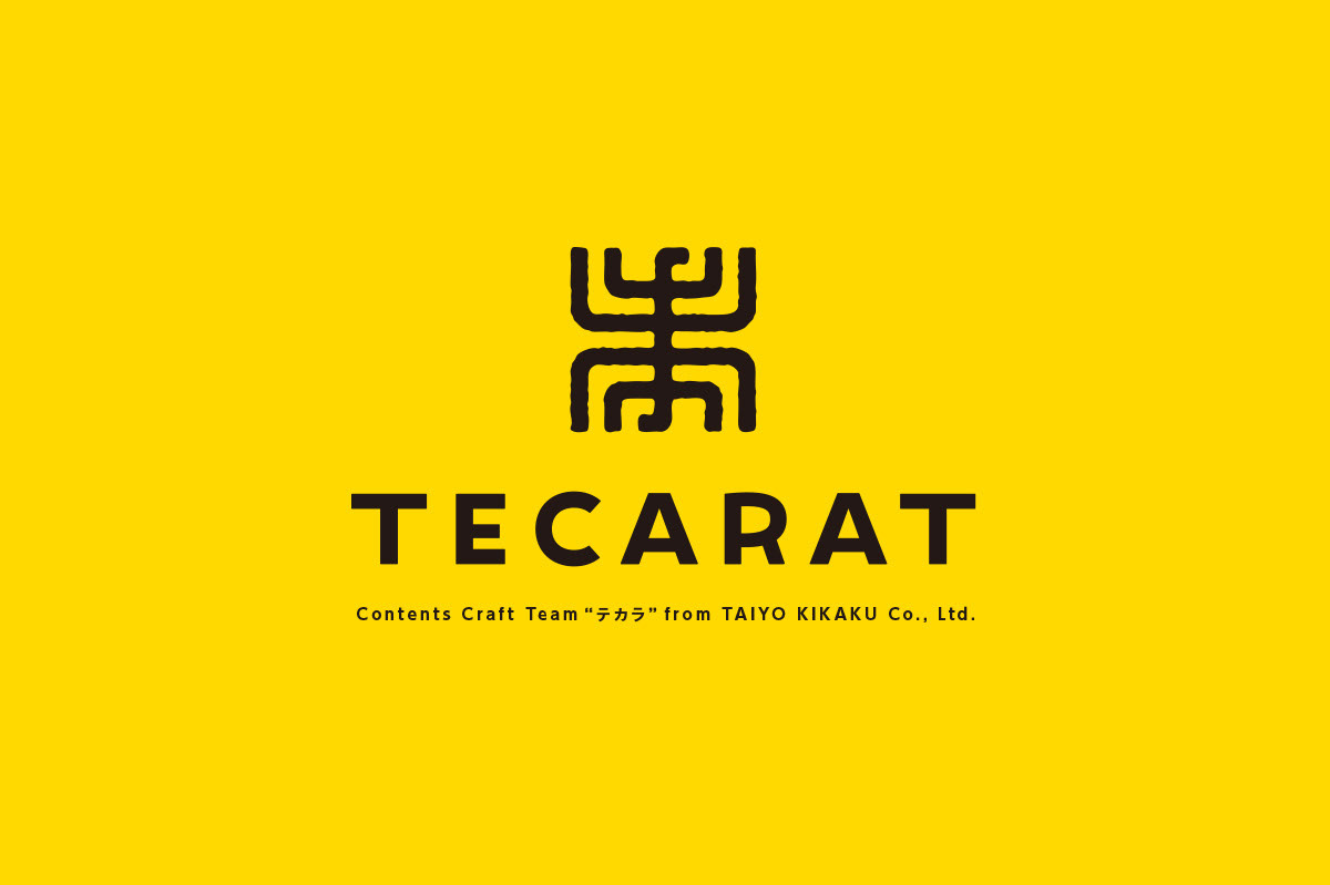
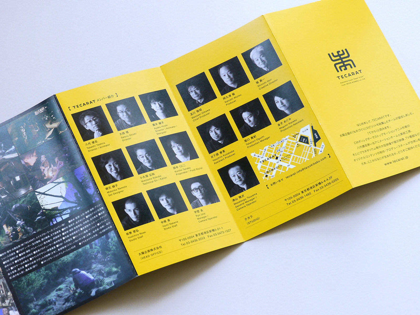
A brand launched by a commercial production company as a team specializing in content production. They bring not only stop motion animations, but also video content made by elaborate handiwork to the world. “Te” means “hand”, and “cara” means “from”. The brand’s name genuinely tells you its concept. Everything is created “Te” “cara”. For the logo, I used the kanji for Te as a design motif. It was combined with the same kanji, but upside down to depict the appearance of much handiwork done together. Their new studio uses tools and machines engraved with the logo, which are orderly lined up and seemingly filled with the drive to create.
Client: Taiyo Kikaku Co., Ltd.
Art Director / Designer: Shunpei Yokoyama
Art Director / Designer: Shunpei Yokoyama
—
CM制作会社がコンテンツ制作専用チ―ムとして立ち上げたブランド。ストップモーションアニメーションを中心に、数多くのクラフトワークによる映像を世の中に発信している。その名の通り「手から」すべてを創り出すというコンセプト。シンボルマークは象形文字である「手」をモチーフとし、上下に組み合わせ、多くのスタッフの手仕事が結集する姿を表現。新設された専用スタジオには、シンボルが刻印された道具・工具が整然と並べられ、モノづくりの気配がムンムンしている。
クライアント: 太陽企画株式会社
アートディレクター、デザイナー:横山俊平
アートディレクター、デザイナー:横山俊平