2004
Tomonaga Yoga Institute
Logos, Corporate Identity
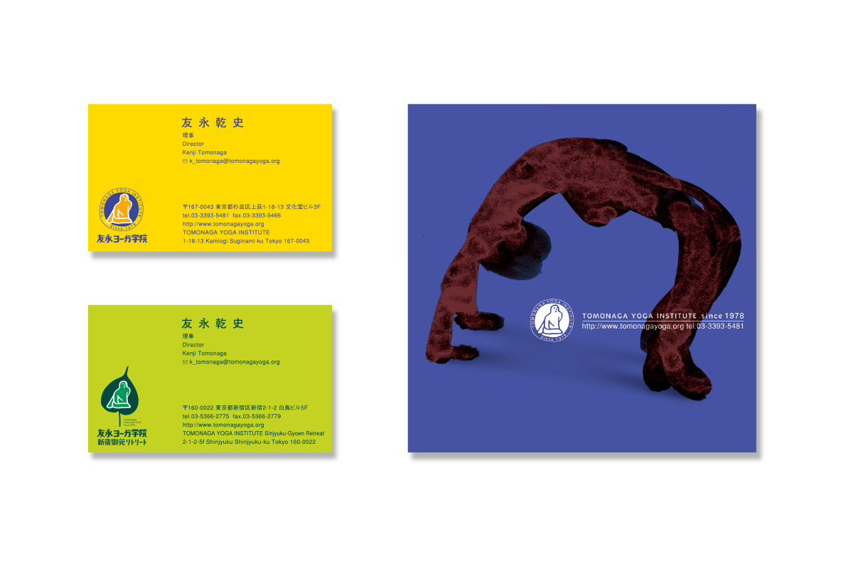
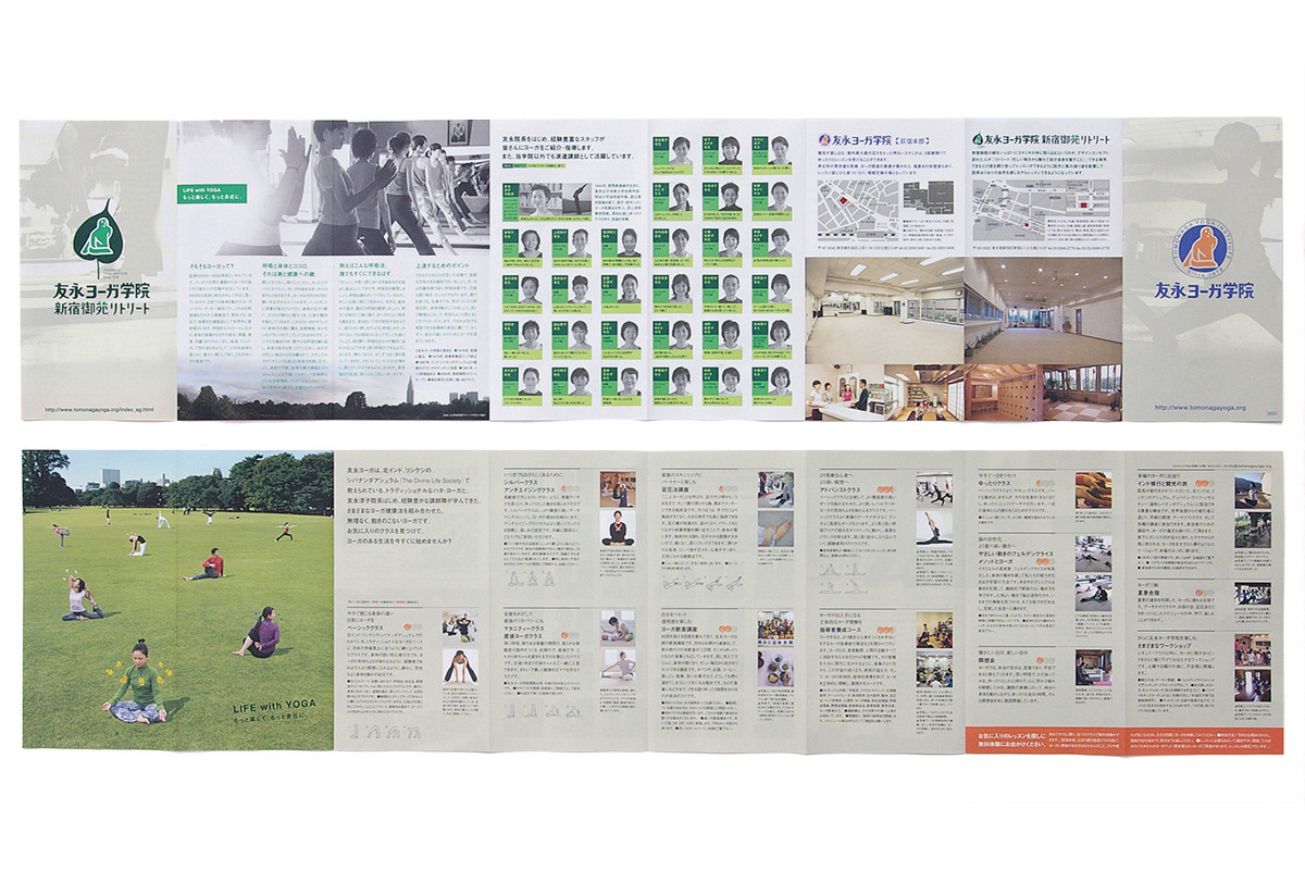
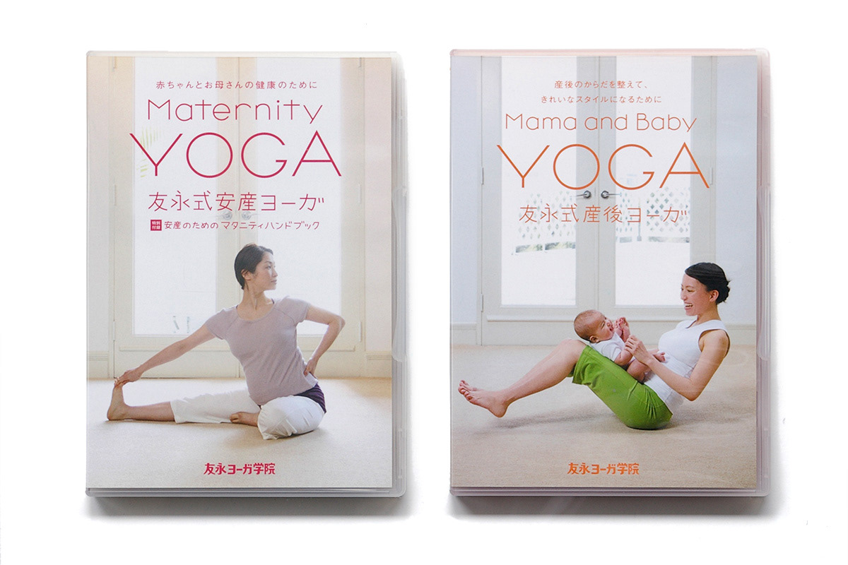
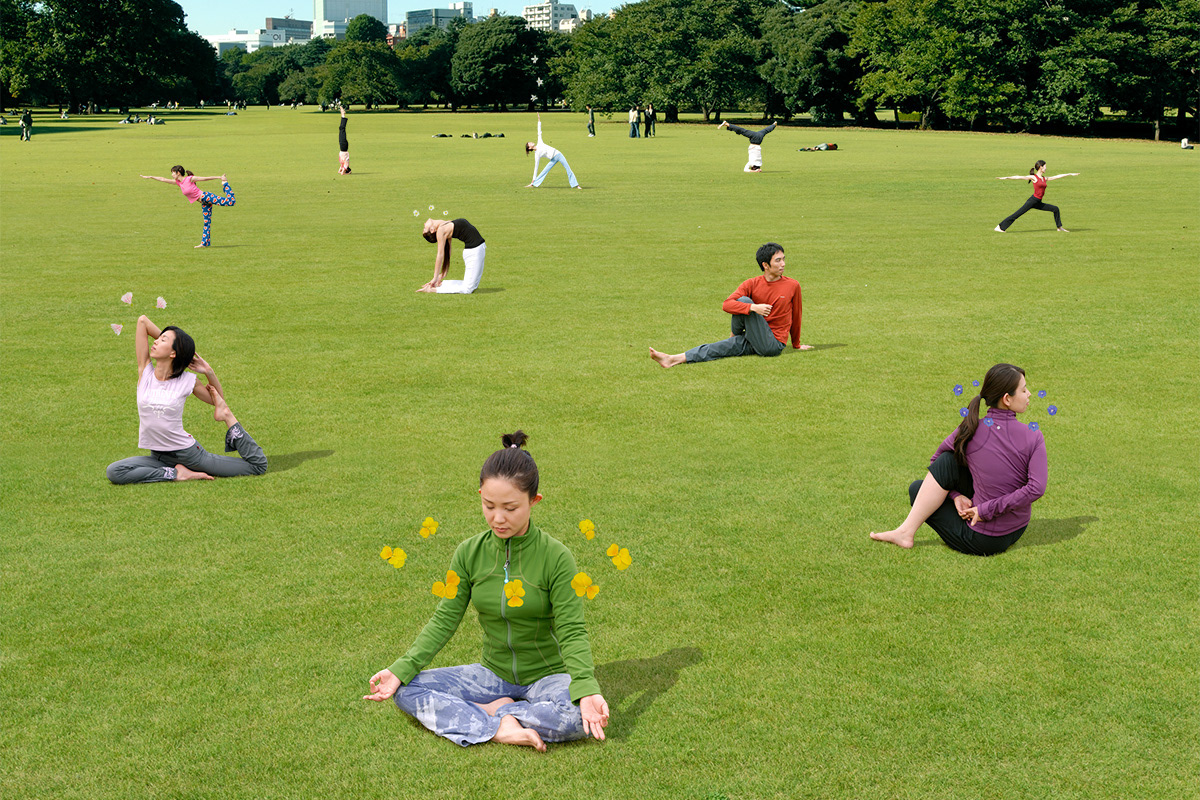
A yoga institute founded in 1978 that has trained and produced many yoga instructors by running classes not only for young people, but also for seniors, with the concept: yoga that is kind to the body and soul. Compared to other yoga schools, their method emphasizes “mind” more. In the CI renewal, the design has been made not to evoke religion, while taking advantage of the characteristics of the institute, such as using a soothing pose, which is used in the logo.
Client: Tomonaga Yoga Institute
Art Director / Designer: Shunpei Yokoyama
Photographer: Studio Peace, Jiro Hirayama
Art Director / Designer: Shunpei Yokoyama
Photographer: Studio Peace, Jiro Hirayama
—
1978年創設のこの学院は「カラダとココロに優しいヨーガ」をコンセプトに、若者に限らずシニア向けのクラスも運営し、多くのヨガ指導者を育成・輩出して来た。友永ヨーガのメソッドは、他所のヨガ教室に比べて「ココロ」に重きを置いていること。CIリニューアルでは、心安らぐポーズをシンボルマークにするなど、学院の特徴を活かしつつ宗教色を感じさせないデザインとした。
クライアント: 友永ヨーガ学院
アートディレクター、デザイナー:横山俊平
カメラマン:スタジオピース、平山ジロー
アートディレクター、デザイナー:横山俊平
カメラマン:スタジオピース、平山ジロー