2015
Wako Corporation
Logos, Corporate Identity
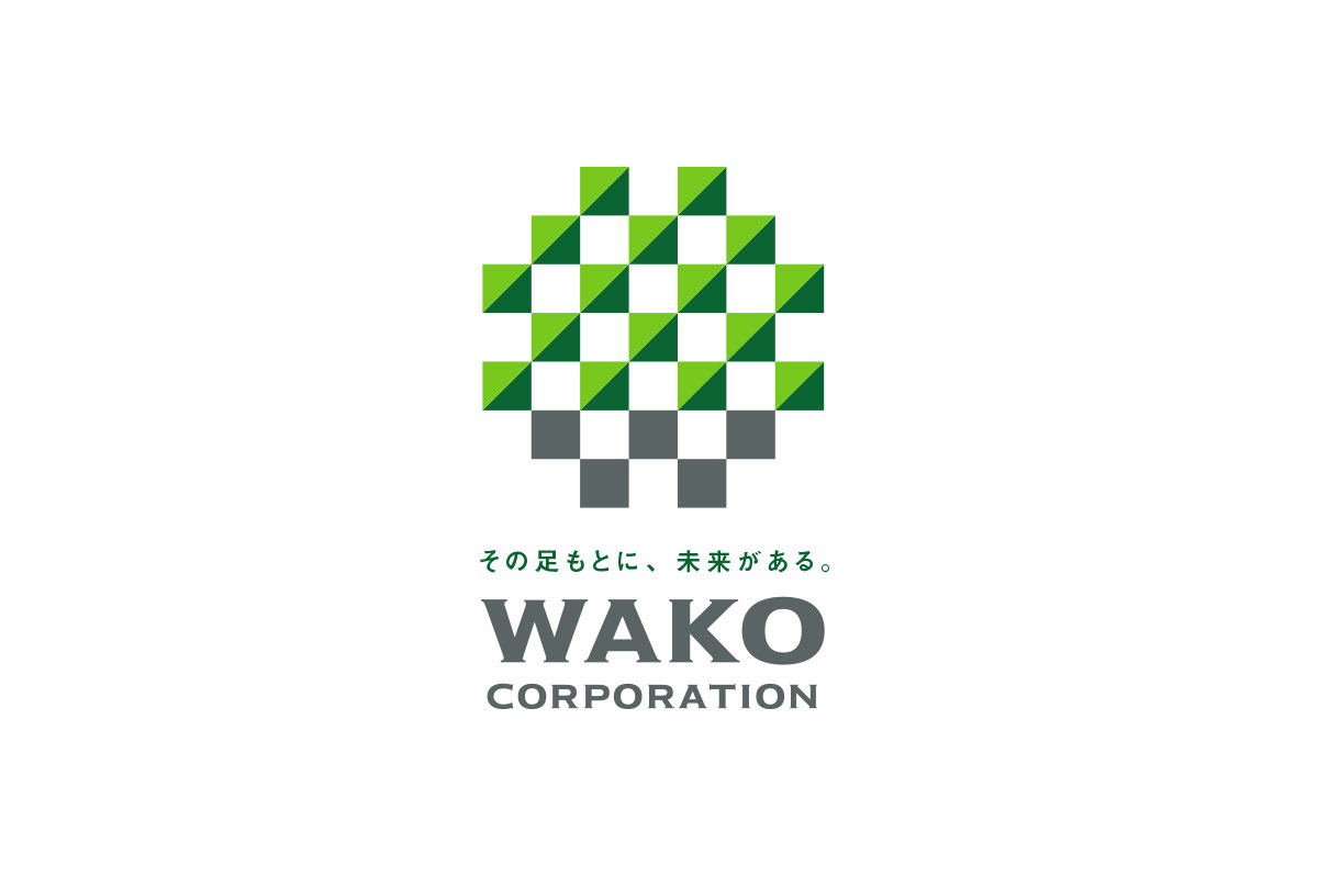
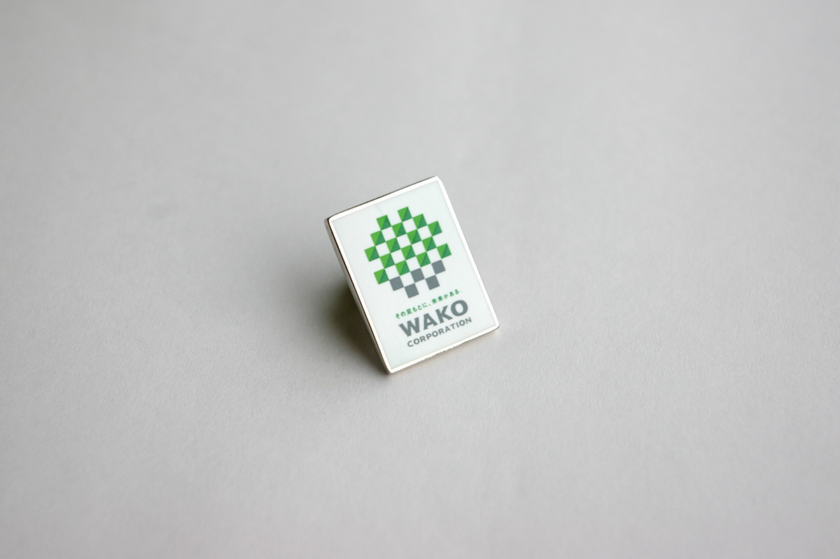
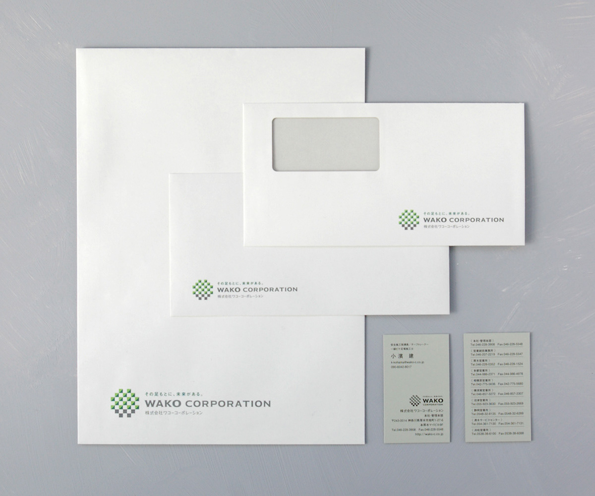
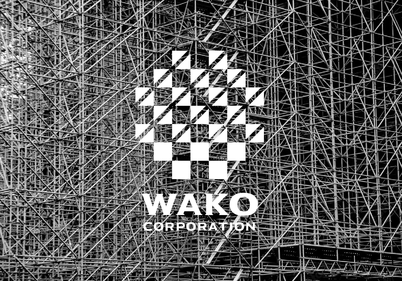
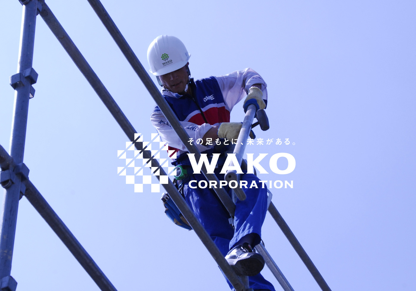
CI renewal for a scaffolding construction company celebrating its 50th anniversary. Through questionnaires, interviews, and various surveys with employees, I learned about the pride they take in their work. On the other hand, I also learned the frustration of not being able to share their aspiration with society because the industry tends to be classified as blue-collar work. The design goal was to solve that gap. In the logo, when looking at the lower part of the symbol, you will see a “W” in gray, taken from the company name and representing the support for society as its foundation. Also, the entire symbol represents the aspects of scaffolding by connecting structures, connecting people, and safely by the cross patterns that one can perceive within the logo. I believe that the CI communicates their pride that scaffolding is one of the initial tasks at a construction site, and they are responsible for the workers' lives and support the project as the unsung heroes.
Client: Wako Corporation Inc.
Art Director / Designer: Shunpei Yokoyama
Copy Writer: Shigeru Isobe
—Copy Writer: Shigeru Isobe
創業50周年を迎えた足場施工会社のCIリニューアル。アンケートやインタビュー、様々な調査を通して、社内の方が持つ仕事に対する誇りと、一方でその志を社会と共有できていないもどかしさを知った。そのギャップを解決するためのデザイン。シンボルマークは社名頭文字「W」が土台として社会を支える姿を表し、同時に足場を組む姿、「コマ(建材)」の姿、そして人と人を繋ぐ姿、その間にたくさんの安全マークが潜んで見える。「最初に現場に入り、職人の命を預かり、縁の下の力持ちとして現場を支える」といったメッセージを高く掲げるためのCIになったと信じている。
クライアント: 株式会社ワコーコーポレーション
アートディレクター、デザイナー:横山俊平
コピーライター:磯部滋
アートディレクター、デザイナー:横山俊平
コピーライター:磯部滋