2022
withJOY
Logos, Visual Identity
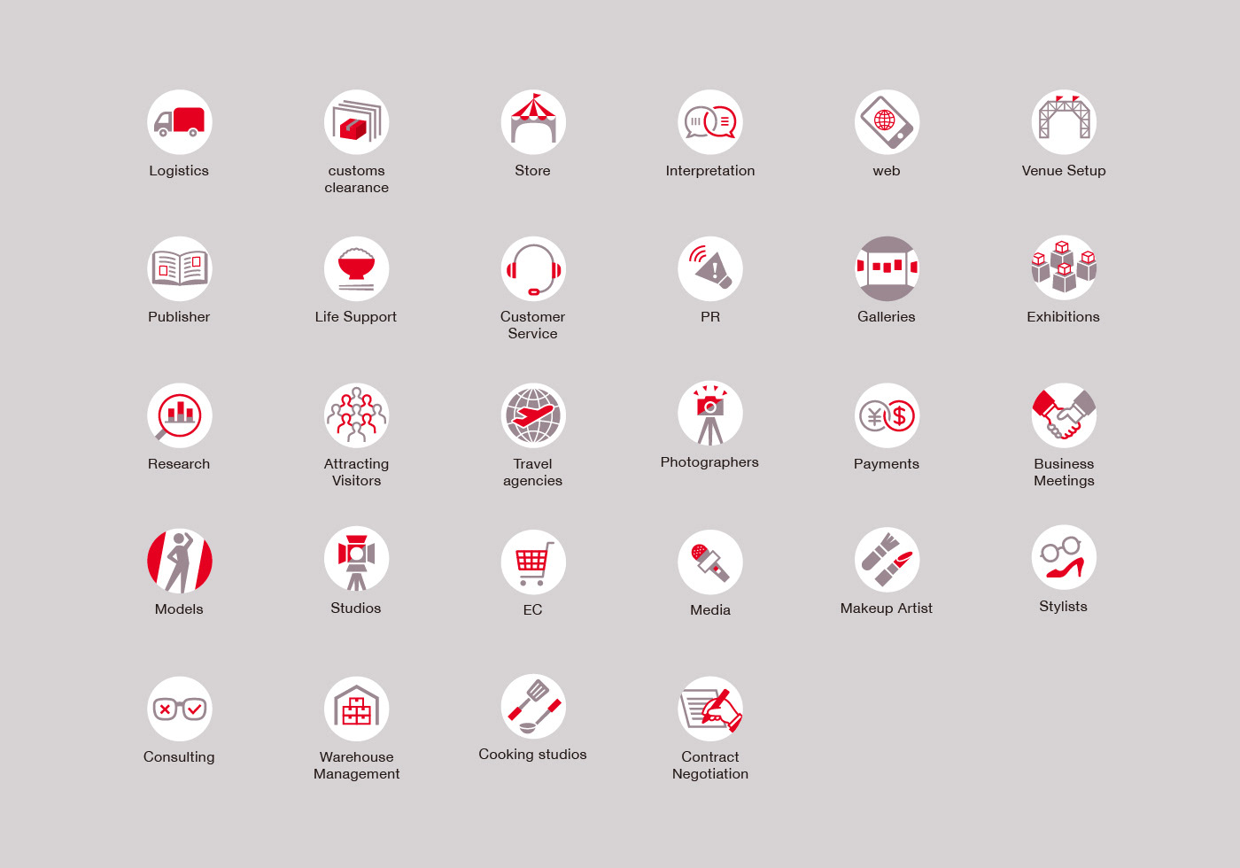
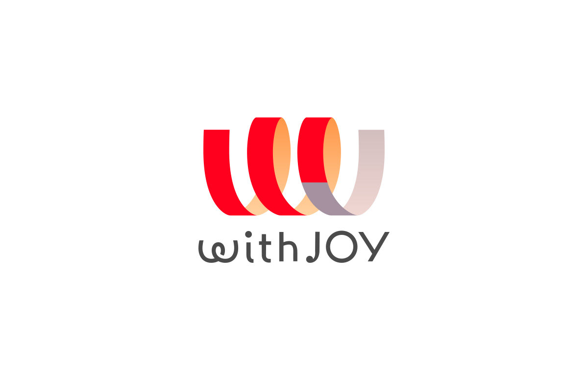
A logo for a trading company that connects Japan with the world. It expresses the company's philosophy of "making the world fun and happy".The design, which combines from the company’s name the "W" and "J", also implies the message "World" and "Japan". The brush stroke, which is not found in ordinary cursive handwriting, represents the company's attitude of building new networks that differ from conventional systems.
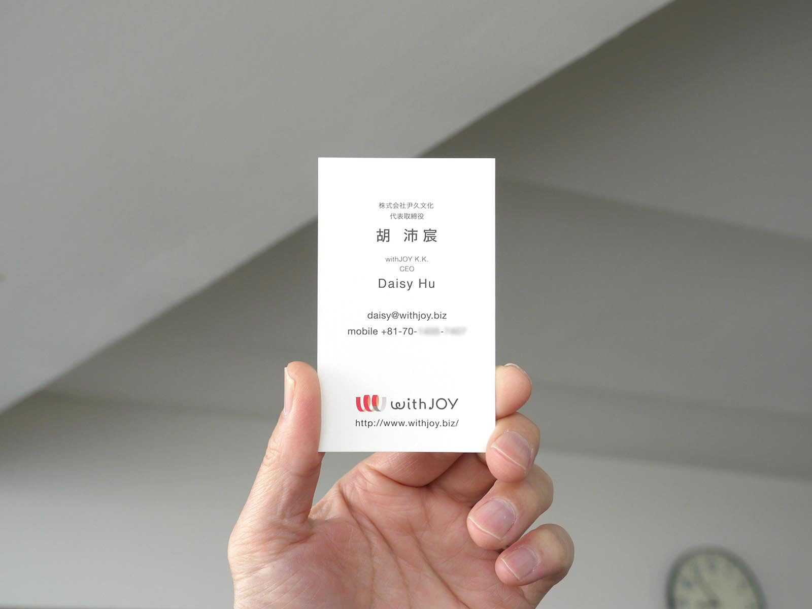
Client: withJOY K.K.
Art Director / Designer: Shunpei Yokoyama
Coding: Flat End LLC
Art Director / Designer: Shunpei Yokoyama
Coding: Flat End LLC
—
日本と世界をつなぐ商社のシンボルマーク。世界を楽しくHAPPYにするという会社の使命をデザインした。社名「W」と「J」をワンストップでつなげる表現。それは「World」と「Japan」というメッセージも含んでいる。通常の筆記体と違う「筆の運び」は、従来の仕組みと異なる、新しいネットワークを構築する姿勢を表している。
クライアント: withJOY K.K.
アートディレクター、デザイナー:横山俊平
コーディング:合同会社フラットエンド
アートディレクター、デザイナー:横山俊平
コーディング:合同会社フラットエンド